2016
Measuring Broadband America
Fixed Broadband Report
A Report on Consumer Fixed Broadband Performance
in the United States

Federal Communications Commission
Office of Engineering and Technology
and
Office of Strategic Planning & Policy Analysis
Table of Contents
- Executive Summary
- Summary of Key Findings

- Methodology

- Test Results

- Additional test results

- Appendix A: Changes in Measurement Methodology from Previous Reports
- Chart 1: Maximum advertised download speed among the most popular service tiers
- Chart 2: Consumer migration to higher advertised download speeds
- Chart 3: Median download speeds by ISP, 2011 to 2015
- Chart 4: The ratio of weighted median speed to advertised speed for each ISP
- Chart 5: The percentage of consumers whose median download speed was (a) greater than 95%, (b) between 80% and 95%, and (c) less than 80% of the advertised download speed
- Chart 6: The ratio of 80/80 consistent median download speed to advertised download speed
- Chart 7: Latency by ISP
- Chart 8: Packet loss by ISP
- Chart 9: Average webpage download time, by advertised download speed
- Chart 10: Maximum advertised upload speed among the most popular service tiers
- Chart 11: Median upload speeds by ISP, 2011 to 2015
- Chart 12.1: Median download speeds by technology, 2011 to 2015
- Chart 12.2: Median upload speeds by technology, 2011 to 2015
- Chart 13.1: The ratio of median download speed to advertised download speed, 2011 to 2015
- Chart 13.2: The ratio of median upload speed to advertised upload speed, 2011 to 2015
- Chart 14: The percentage of consumers whose median upload speed was (a) greater than 95%, (b) between 80% and 95%, and (c) less than 80% of the advertised upload speed
- Chart 15.1: Complementary cumulative distribution of the ratio of median download speed to advertised download speed
- Chart 15.2: Complementary cumulative distribution of the ratio of median download speed to advertised download speed (continued)
- Chart 15.3: Complementary cumulative distribution of the ratio of median download speed to advertised download speed, by technology
- Chart 15.4: Complementary cumulative distribution of the ratio of median upload speed to advertised upload speed
- Chart 15.5: Complementary cumulative distribution of the ratio of median upload speed to advertised upload speed (continued
- Chart 15.6: Complementary cumulative distribution of the ratio of median upload speed to advertised upload speed, by technology
- Chart 16.1: The ratio of median download speed to advertised download speed, peak versus off-peak
- Chart 16.2: The ratio of median upload speed to advertised upload speed, peak versus off-peak
- Chart 17.1: The ratio of median download speed to advertised download speed, M-F 2 hour time blocks, terrestrial ISPs
- Chart 17.2: The ratio of median download speed to advertised download speed, M-F 2 hour time blocks, satellite ISPs
- Chart 18.1: The ratio of 80/80 consistent upload speed to advertised upload speed
- Chart 18.2: The ratio of 70/70 consistent download speed to advertised download speed
- Chart 18.3: The ratio of 70/70 consistent upload speed to advertised upload speed
- Chart 19: Advertised download speed and median download speed, by region and by technology
- Chart 20: Latency, by technology and by advertised download speed
- Chart 21.1: The ratio of median download speed to advertised download speed, by ISP (0-5 Mbps
- Chart 21.2: The ratio of median download speed to advertised download speed, by ISP (6-10 Mbps)
- Chart 21.3: The ratio of median download speed to advertised download speed, by ISP (12-15 Mbps)
- Chart 21.4: The ratio of median download speed to advertised download speed, by ISP (18-25 Mbps)
- Chart 21.5: The ratio of median download speed to advertised download speed, by ISP (30-50 Mbps)
- Chart 21.6: The ratio of median download speed to advertised download speed, by ISP (60-300 Mbps)
- Chart 22.1: The ratio of median upload speed to advertised upload speed, by ISP (0.256-0.64 Mbps)
- Chart 22.2: The ratio of median upload speed to advertised upload speed, by ISP (0.768-1.5 Mbps)
- Chart 22.3: The ratio of median upload speed to advertised upload speed, by ISP (2-5 Mbps)
- Chart 22.4: The ratio of median upload speed to advertised upload speed, by ISP (6-10 Mbps)
- Chart 22.5: The ratio of median upload speed to advertised upload speed, by ISP (20-75 Mbps
- Chart 23.1: The percentage of consumers whose median download speed was (a) greater than 95%, (b) between 80% and 95%, and (c) less than 80% of the advertised download speed, by service tier
- Chart 23.2: The percentage of consumers whose median download speed was (a) greater than 95%, (b) between 80% and 95%, and (c) less than 80% of the advertised download speed (contd)
- Chart 23.3: The percentage of consumers whose median download speed was (a) greater than 95%, (b) between 80% and 95%, and (c) less than 80% of the advertised download speed (contd.)
- Chart 24.1: The percentage of consumers whose median upload speed was (a) greater than 95%, (b) between 80% and 95%, and (c) less than 80% of the advertised upload speed
- Chart 24.2: The percentage of consumers whose median upload speed was (a) greater than 95%, (b) between 80% and 95%, and (c) less than 80% of the advertised upload speed (continued)
- Chart 24.3: The percentage of consumers whose median upload speed was (a) greater than 95%, (b) between 80% and 95%, and (c) less than 80% of the advertised upload speed (continued)
- Chart 25: Peak Period Burst Download Speeds as a Percentage Increase over Median Download Speeds, by ISP (where tiers showed a greater than 10% Increase)
- Chart 26.1: Average webpage download time, by ISP (1-3 Mbps)
- Chart 26.2: Average webpage download time, by ISP (5-10 Mbps)
- Chart 26.3: Average webpage download time, by ISP (12-15 Mbps)
- Chart 26.4: Average webpage download time, by ISP (18-25 Mbps)
- Chart 26.5: Average webpage download time, by ISP (30-50 Mbps)
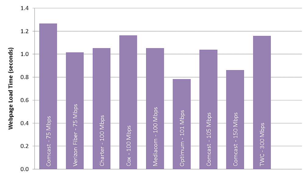
- Chart 26.6: Average webpage download time, by ISP (60-300 Mbps)
- Chart A.1: Comparison of Unweighted Mean and Unweighted Median Download Speed at peak hours (in Mbps)
- Chart A.2: Comparison of Unweighted Mean and Unweighted Median Latencies at peak hours (in ms) shown separately for terrestrial-based and satellite-based ISPs
- Chart A.3: Comparison of Unweighted Mean and Weighted Median Download Speed at peak hours (in Mbps)
- Chart A.4: Comparison of Unweighted Mean and Weighted Median Latencies at peak hours (in ms) shown separately for terrestrial-based and satellite-based ISPs
- Chart A.5: Comparison of 2015 Unweighted Mean and 2016 Weighted Median Download Speed at peak hours (in Mbps for all ISPs)
- Chart A.6: Comparison of 2015 Unweighted Mean and 2016 Weighted Median Latencies at peak hours (in ms) shown separately for terrestrial-based and satellite-based ISPs
- Table 1: The most popular advertised service tiers
- Table 2: Peak Period Median download speed, by ISP
- Table 3: Complementary cumulative distribution of the ratio of median download speed to advertised download speed, by technology, by ISP
- Table 4: Complementary cumulative distribution of the ratio of median upload speed to advertised upload speed, by technology, by ISP
- Table 5: Statewide Download Speed with Sample Size by Technology
- Table 6: States with Low Sample Counts
- Table 7: Form 477 Statistics for Connections by Technology by State as of December 31, 2014 for States in Figures 33 and 34 (connections over 200 kbps in at least one direction, in thousands)
1. Executive Summary
The 2016 Measuring Broadband America Fixed Broadband Report (“the 2016 Report”) contains the most recent data collected from fixed Internet Service Providers (ISPs) as part of the Federal Communication Commission’s (FCC) Measuring Broadband America (MBA) program. This program is an ongoing, rigorous, nationwide study of consumer broadband performance in the United States. We measure the network performance delivered on selected service tiers of a representative sample set of the population. The thousands of volunteer sample panelists are drawn from subscribers of Internet Service Providers serving over 80% of the residential marketplace.
The initial Measuring Broadband America Fixed Broadband Report was published in August 2011, and presented the first broad-scale study of directly measured consumer broadband performance throughout the United States. Including the 2016 Report, six reports have now been issued.[1] These annual reports provide a performance benchmark for fixed broadband Internet access services in the United States, and track progress towards the Commission’s continuing goal of improving the speeds and quality of broadband access commonly available to the American public.
These reports present analysis of broadband information in a variety of ways and have evolved with changes to make the information more understandable and useful.
A. Major Findings of the 2016 Report
The key findings of this report were:
The maximum advertised download speeds amongst the most popular service tiers offered by ISPs have increased from 12-30 Mbps in March 2011 (when the program first launched) to 100-300 Mbps in September 2015. These increases are not uniform across access technologies and have been driven primarily by the cable industry, with smaller increases in fiber based systems. Average DSL speeds have increased only slightly over these years and satellite speeds, over a shorter time interval, have remained constant.
- The median speed across all consumers this year is 39 Mbps which represents a 22% increase to last year’s value of 32 Mbps, indicating that consumer speeds are continuing to increase.
- For most of the major broadband providers that were tested, actual download speeds are 100% of advertised speeds or better. The exceptions are DSL providers (AT&T-DSL, CenturyLink, Frontier DSL and Windstream)) and one satellite provider (Viasat).
- The overwhelming majority of ISPs performed within 10% of last year’s results. The exception for this was satellite ISPs. Hughes’ actual vs. advertised speeds ratio went down from 203% to 152% while Viasat’s went down from 107% to 71%. This is likely the result of increased subscribership and consumer usage of these services. Future proposed launches of more advanced satellites would likely reverse this trend.
- One of the key measures for ISP performance is the 80/80 speed consistency which is the speed that at least 80% of the subscribers experience at least 80% of the time over peak periods. Optimum, Charter, Time-Warner Cable and Verizon (FiOS) did well with values rising above 90% of the advertised speed. This ratio fell below 50% for AT&T (DSL), Frontier (fiber) and Viasat (satellite).
These, and other findings, are described in greater detail within this Report. This 2016 report includes two changes affecting how data is statistically calculated and presented.
B. Use Of Medians Instead Of Means For Broadband Speed Metrics
Past reports presented ISP broadband performance as the mean or average of broadband speeds experienced by panelists in specific service tiers. The 2016 report presents ISP broadband performance as the median[2] of speeds experienced by panelists within a specific service tier. Averperformance. This change also aligns the report’s analysis with the Open Internet Order of 2015[3] and the subsequent 2016 Guidance on Open Internet Transparency Rule Requirements[4] that clarifies that fixed Broadband Internet Access Service providers may comply with the Open Internet Order transparency requirement disclosing either the median speed or a range of actual speeds that includes the median speed (e.g., 25th to 75th percentile). We had noted in the 2015 Measuring Broadband America Report our intent to align the Report with the policies underlying the Open Internet Order. Measurements used in the Report will continue to evolve with Commission policies.
This change also improves the ability to compare the analysis of fixed and mobile broadband statistics. The reporting of median speeds and percentiles provides a harmonious and consistent reporting metric for use across all broadband technologies with transparency disclosure obligations under the rules for the Open Internet. For continuity and comparison’s sake, calculations based on means will continue to be included in our spreadsheet of statistical values which has traditionally accompanied this Report.
To evaluate the impact of the shift from using mean speeds to median speeds both sets of values were computed and compared. The two sets of values were within 5% of each other which implies that the measured values were, in general, only slightly skewed. Details of the comparison between mean and median values are given in Appendix A.
C. Use Of Weighted Medians By Tier Subscriber Counts
In past reports an aggregate mean representing an ISP’s performance across all service tiers was calculated as an unweighted average of the performance of all panelists for an ISP. This approach has the disadvantage of not explicitly recognizing that the market share for each service tier differs, with some tiers supporting more consumers than others. In discussion with the ISPs it was agreed that going forward, aggregate medians would be weighted to reflect the number of subscribers of each service tier; i.e., service tiers with larger numbers of subscribers would affect the overall values more than service tiers with fewer subscribers. This Report calculates the weighted median of an ISP’s performance by weighting the median for each service tier by the number of subscribers.
In adopting this policy of calculating a weighted median, we have drawn upon two sources for determining the number of subscribers per service tier. ISPs can voluntarily contribute their data per surveyed service tier as the most recent and authoritative data. Many ISPs have chosen to do so.[5] When such information is not provided by an ISP, we draw from the FCC’s 477 data[6]. All facilities-based broadband providers are required to file data with the FCC twice a year (Form 477) regarding deployment of broadband services. The 477 data provides an alternative source of information for the number of subscribers of an ISP’s service tier.
The shift from using unweighted means to weighted medians has had a minimal effect for most ISPs. The difference was generally within 5% (see Appendix A). The exceptions were for four ISPs (Optimum, Comcast, Mediacom and TWC), for whom the difference between unweighted means and weighted medians were between 8% and 20%. This suggests that for these companies, the number of panelists per service tier is not representative of the ISP’s customer base. Using subscriber weighted medians corrects for this skewing.
We expect to continue to report weighted medians in the future. In addition, we are maintaining our unweighted mean calculations in our table of statistical values.
D. Continued Growth In Broadband Speeds
As in previous reports, we continue to see significant growth in broadband speeds and their uptake by consumers, though results are not uniform across technologies. While fiber based systems continue to have the highest weighted median speeds, cable based ISPs are driving the growth in new high speed service tiers. Spurred by the deployment of improved technologies such as DOCSIS 3, the maximum advertised download speeds among the most popular service tiers offered by ISPs using cable technologies have increased from 12-30 Mbps in March 2011 to 100-300 Mbps in September 2015. In contrast, the maximum advertised download speeds that were tested among the most popular service tiers offered by ISPs using DSL technology have, with some exceptions, changed little since 2011. We note that DSL technology is capable of attaining speeds comparable to cable and fiber technologies, but that improvements in DSL plant structure and electronic devices may be required, adding to overall expense of the service. We have also been notified by some ISPs using DSL technology that they offer speeds significantly in excess of those surveyed in this report, though not in sufficient scale to be included under our methodology[7]. Our focus in these reports is on the most common service tiers used by 5% or more of an ISP’s subscribers. We find on this basis that there is a growing disparity in download speeds surveyed between DSL and cable and fiber technologies. This disparity has been growing since our initial Report.
Due to the characteristics of the industry, satellite broadband services are another area where performance growth is uneven. Put simply, performance increases for satellite technology are dependent upon the launch of new satellites which add capacity and can also increase attainable consumer speeds. The industry saw an approximate order of magnitude performance increase with the introduction of satellites operating in Ka-band frequencies beginning in late 2011. Performance from these satellites has declined as capacity limits are being reached. Satellite companies are continuing to invest in technologies promising higher capacity and speed. Next generation Ka-band satellites are planned to be launched beginning in late 2016[8], and we will track how these newer generation of satellites affect overall consumer performance.
Due to the characteristics of the industry, satellite broadband services are another area where performance growth is uneven. Put simply, performance increases for satellite technology are dependent upon the launch of new satellites which add capacity and can also increase attainable consumer speeds. The industry saw an approximate order of magnitude performance increase with the introduction of satellites operating in Ka-band frequencies beginning in late 2011. Performance from these satellites has declined as capacity limits are being reached. Satellite companies are continuing to invest in technologies promising higher capacity and speed. Next generation Ka band satellites are planned to be launched beginning in late 2016, and we will track how these newer generation of satellites affect overall consumer performance.
As in our previous reports, we found that generally actual speeds experienced by subscribers nearly meet or exceed those advertised by ISPs. However, the actual speeds experienced by subscribers of some ISPs using DSL were typically lower than the advertised “up-to” speeds for their respective providers. In addition, one satellite company (ViaSat) had a significant decline in performance from previous years in this regard with performance significantly below that of advertised speed; suggesting, as noted, that capacity limits are being approached for its current satellite constellation. ViaSat has indicated that future launches for additional capacity are planned in 2017.
Consistency of speed may be more important to customers who are heavy users of applications that are both high bandwidth and sensitive to short duration declines in actual speed, such as streaming video.[9] We therefore report on the consistency of service delivered to the consumer. We present statistics on the minimum actual speed experienced by at least 80% of panelists during at least 80% of the peak usage period (“80/80 consistent speed” measure) as well as the percentage of consumers achieving median speeds greater than 95%, between 80% and 95%, and less than 80% of their advertised speeds.
Although actual download and upload speeds remain the network performance metric of greatest interest to the consumer, we spotlight two other key network performance metrics in this report: latency and packet loss. These metrics can significantly affect the overall quality of a consumer’s broadband service.
Latency is the time it takes for a data packet to travel across a network from one point on the network to another. High latencies may affect the perceived quality of some interactive services such as phone calls over the Internet, video chat, or online multiplayer games. Latencies among terrestrial-based broadband services are typically small and are unlikely to affect the perceived quality of applications. The higher latencies of satellite-based broadband services may negatively affect the perceived quality of such highly interactive applications. Not all applications are affected by high latencies, for example, video streaming applications are tolerant of relatively high latencies.
Packet loss measures the rate at which data packets in a stream of data fail to be delivered to the intended destination. Packet loss may affect the perceived quality of applications that do not request retransmission of lost packets, such as phone calls over the Internet, video chat, some online multiplayer games, and some video streaming. However, packet losses of a few tenths of a percent are sufficiently small so that they are unlikely to significantly affect the perceived quality of most such applications and normally occur in the transmission of data packets across a network. Packet loss is unlikely to directly affect the perceived quality of applications that do request retransmission of lost packets, such as web browsing and email.
Reporting by ISPs on speed, packet loss and latency are required by the 2015 Open Internet Order and we therefore include them in this report. The Internet is continuing to evolve along multiple dimensions: architecture, performance, and services. We will continue to evolve our measurement methodologies to help consumers understand the performance characteristics of their broadband Internet access service, and thus make informed choices about their use of such services.
2. Summary of Key Findings
A. Most Popular Advertised Service Tiers
As explained in more detail in the methodology section below, these reports focus on the most popular service tiers offered by each participating ISP, as shown in Table 1, which together constitute the majority of the broadband plans subscribed to by their consumers. If a participating ISP offers a faster service tier than shown here, but if its number of subscribers is less than 5% of the total subscriber base of the ISP, it is not analyzed herein.[10]
Table 1: The most popular advertised service tiers
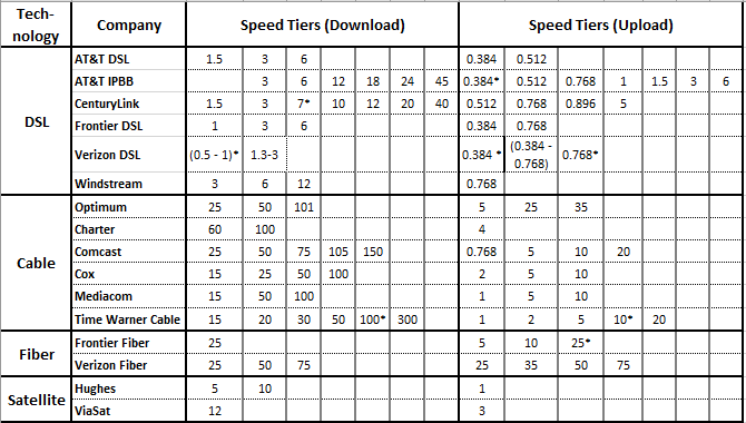
* Tiers that don't have enough samples
Chart 1 (below) displays the maximum advertised download speeds among the most popular service tiers for each participating ISP, during the years 2011-2015, grouped by the access technology used to offer the broadband Internet access service (DSL, cable, fiber, and satellite). Between September 2014 and September 2015, we observe an average 45% annual increase in the maximum advertised download speeds among the most popular service tiers across participating ISPs weighted by the number of participant panelists that joined the MBA study for each ISP tier[11].
These increases are not uniform across access technologies. Chart 1 shows that when DSL is used to provide broadband service, the maximum advertised download speeds among the most popular service tiers has increased only slightly since 2011.[12] In contrast, for cable services, the maximum advertised download speeds among the most popular service tiers have increased from 12-30 Mbps in March 2011 to 100-300 Mbps in September 2015.[13] Cable broadband ISPs are able to provide these high speed services by taking advantage of the increase in download speeds made possible by the transition from DOCSIS 2 to DOCSIS 3 technology.[14]
Chart 1: Maximum advertised download speed among the most popular service tiers

Among participating broadband ISPs, only Frontier and Verizon use fiber as the access technology for a substantial number of their customers. While the maximum download speed measured by SamKnows for Frontier’s Fiber product has remained 25 Mbps throughout the course of these Reports[15] the maximum popular download speed included in our survey for Verizon more than doubled from 35 Mbps to 75 Mbps in 2012 and has remained at that speed in subsequent years. Current, fiber based technologies have the highest weighted median speed across technologies.
We reported results for ViaSat (Exede) starting September 2012 and for Hughes starting September 2014, representing when each began its respective participation in the program. The maximum tiers for Satellite ISPs have remained unchanged during these years. Future deployment of next generation satellites, expected to begin in late 2016, have the potential for increasing capacity and overall performance.
The maximum advertised download speed among the most popular service tiers, weighted by the number of panelists in each tier, increased from 72 Mbps in September 2014 to 105 Mbps in September 2015, a growth of 45%.
Chart 2 charts the migration of panelists to a higher service tier based on their access technology.[16] Specifically, the horizontal axis of Chart 2 partitions the September 2014 panelists by the advertised download speed of the service tier to which they are subscribed. For each such set of panelists who also participated in the September 2015 collection of data,[17] the vertical axis of Chart 2 displays the percentage of panelists that migrated by September 2015 to a service tier with a higher advertised download speed. There are two ways that such a migration can occur: (1) if a panelist changed their broadband plan during the intervening year to a service tier with a higher advertised download speed, or (2) if a panelist did not change their broadband plan but the panelist’s ISP increased the advertised download speed of the panelist’s subscribed plan.[18]
Chart 2: Consumer migration to higher advertised download speeds

B. Median Download Speeds
Advertised download speeds may differ from that actually experienced by subscribers for several reasons. First, network operational performance of ISPs may vary, with some ISPs more consistently meeting network service objectives than others. Second, speeds experienced by different consumers subscribed to the same ISP and the same service tier may vary across a geographical region. Third, speeds experienced by a particular consumer will vary during the day based on variations in the aggregate Internet usage by all subscribers to that same network. We examine the performance of individual carriers. Unless stated otherwise, all actual speeds are measured only during peak usage periods.
Also this year, in calculating the typical consumer-experienced speed across all subscribers of an ISP that might be offering multiple tiers, we have shifted to using a median speed for each tier and weighing these medians by their subscriber numbers. As noted, data for the appropriate weightings was drawn from the ISPs themselves or secondarily from FCC data. In previous years we computed the mean speed for each tier and weighted the tiers by the number of panelists in each tier.
Chart 3 shows the median download speeds experienced by each participating ISP’s subscribers—averaged across all analyzed service tiers, geography, and time —from 2011 to 2015. As mentioned above, Chart 3 only applies statistical weighting to the data for 2015, while prior year data do not reflect this methodology. As a result, shifts from 2014-2015 may not reflect trends in an ISP’s performance over that period. The median download speed, averaged across all participating ISPs, has almost quadrupled during this period, from approximately 10 Mbps in March 2011, to approximately 41 Mbps in September 2015. Compared to last year’s unweighted median speed of 32 Mbps, this year’s speed was an increase of approximately 28%.
Chart 3: Median download speeds by ISP, 2011 to 2015
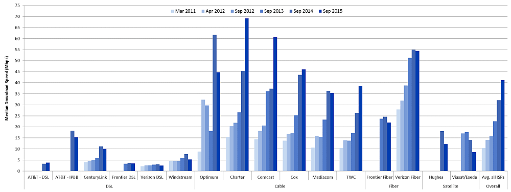
However, as we observed above when examining advertised download speeds, the increase in median download speeds is not uniform across access technologies. For subscribers to DSL-based broadband service, the increase in median download speeds has varied among ISPs, with most ISPs showing little or no change. For subscribers to each of the participating cable broadband services, there have been fairly steady and substantial increases in median download speeds.[19] We find that, over the course of our reports, the overall annual increase in median download speeds by technology has been 21% for DSL,[20] 47% for cable, and 14% for fiber.[21] The large apparent increase is DSL speeds is largely driven by our change in methodology for reporting on AT&T[20] and the relatively large market share for IPBB (IP BroadBand). The apparent increase in DSL speeds for CenturyLink is the result of a merger with Qwest (now included as CenturyLink). For the majority of ISPs using DSL, there has been little change in speeds over the course of these reports.
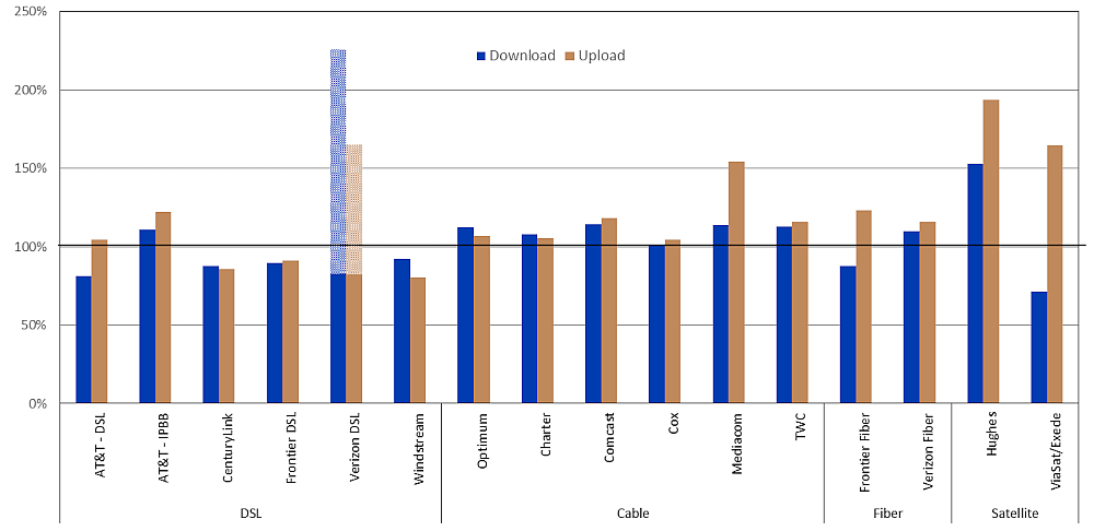
Chart 4 shows the ratio of the weighted median speeds experienced by an ISP’s subscribers to that ISP’s advertised speeds. The ratios for both download and upload speeds to the advertised download and upload speeds are illustrated. The actual speeds experienced by most ISPs’ subscribers are close to or exceed the advertised speeds. However, DSL broadband ISPs continue to advertise “up-to” speeds that on average exceed the actual speeds experienced by their subscribers. Verizon, instead, advertises a speed range for DSL performance and has requested that we include this range in relevant charts; we indicate this speed range by shading on all bar charts describing Verizon performance. This year we also noted a decrease in the actual speed to advertised speed for satellite ISPs, Hughes went down from 203% to 153% while ViaSat went from 107% to 71%. This may be the effect of new customer additions to the respective networks or increased usage per customer and the capacity of the satellites currently in service. Future launches of more advanced satellites are expected and may reverse this trend.
Chart 4: The ratio of weighted median speed to advertised speed for each ISP
C. Variations In Speeds
As noted above, actual speeds experienced by individual consumers may vary based on location and may vary during each day. Chart 5 shows, for each ISP, the percentage of consumers (across the ISP’s service territory) who experienced a median download speed (averaged over the peak usage period during our measurement period) that was (a) greater than 95%, (b) between 80% and 95%, and (c) less than 80% of the advertised download speed.
Chart 5: The percentage of consumers whose median download speed was (a) greater than 95%, (b) between 80% and 95%, and (c) less than 80% of the advertised download speed
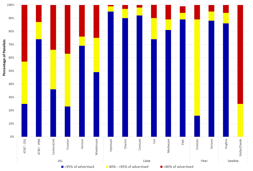
Even though the median download speeds experienced by most ISPs’ subscribers nearly meet or exceed the advertised download speeds, for each ISP there are some panelists for whom median download speed falls significantly short of the advertised download speed. Relatively few subscribers to cable or fiber broadband service experience such shortfalls. The best performing ISPs, when measured by this metric, are Optimum, Charter, TWC, Verizon-Fiber and Hughes; more than 85% of their panelists were able to attain an actual median download speed of at least 95% of the advertised download speed. In contrast, many subscribers to some ISPs’ DSL and satellite broadband service experience median download speeds that fall substantially short of advertised download speeds. In particular, the results for ViaSat show that none of the panelists in our study were able to achieve download speeds of 95% of the advertised speeds during peak periods and that over 70% of the panelists received less than 80% of their advertised speed.
In addition to variation based on a subscriber’s location, speeds experienced by a particular consumer will vary during the day based on variations in aggregate usage by all subscribers to that consumer’s ISP. For purposes of discussion, we use the term “80/80 consistent speed” to refer to the minimum actual speed that was experienced by at least 80% of panelists during at least 80% of the peak usage period. Consistency of speed may be more important to customers who are heavy users of applications that are bandwidth-intensive and sensitive to variations in actual speed.[22]
In comparing the 80/80 consistency speed results for this year with respect to last year’s results, improvements can be seen in the performance of Windstream, Charter, Comcast and TWC. On the other hand, the performance during the testing period of both Hughes' and ViaSat’s satellite-based services and Frontier’s fiber-based service deteriorated this year.[23]
Chart 6 illustrates, for each ISP, the ratio of 80/80 consistent median download speed to advertised download speed, and for reference the ratio of median download speed to advertised download speed shown previously in Chart 4. The ratio of 80/80 consistent median download speed to advertised download speed is less than the ratio of median download speed to advertised download speed for all participating ISPs due to fluctuations in Internet usage that occasionally result in short periods of time when median download speeds are lower than the overall average. When the difference between the two ratios is small, the median download speed is fairly insensitive to both geography and time. When the difference between the two ratios is large, there is a greater variability in median download speed, either based on location or variations during the peak usage period.
Chart 6: The ratio of 80/80 consistent median download speed to advertised download speed.
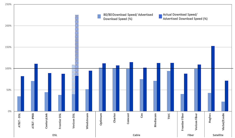
Customers of Optimum, Charter, Comcast, Time-Warner Cable and Verizon Fiber (FiOS) experienced median download speeds that are very consistent; over 90% of the panelists experienced median download speeds at or above 80% of advertised download speeds during at least 80% of the peak usage period. Other companies fared less well regardless of technology. For example, less than 50% of panelists for AT&T (DSL)[24], Frontier (fiber) and ViaSat (satellite) experienced median download speeds that were above 80% of the advertised speed for 80% or more of the time.
D. Latency
Latency is the time it takes for a data packet to travel from one point to another in a network. It increases with the distance between the source and destination and with any congestion on the route. The Measuring Broadband America program measures latency by measuring the round-trip time from the consumer’s home to the closest measurement server and back.
Chart 7 shows the median latency for each participating ISP. In general, higher service tiers have lower latency, an artifact of how data packets are composed by end devices and transported through the network. Satellite technologies inherently display long latency since the round trip path a data packet will travel from an earth station to the satellite and return is very long, approximately 44,000 miles. As a consequence, the median latencies of satellite-based broadband services (which range from 599 ms to 629 ms) are much higher than those for terrestrial-based broadband services (which range from 12 ms to 58 ms).
Chart 7: Latency by ISP
(a) Terrestrial ISPs

(b) Satellite ISPs
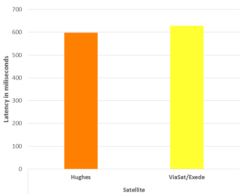
The higher latencies of satellite-based broadband services may negatively affect the perceived quality of highly interactive applications. Amongst terrestrial technologies DSL latencies (between 28 ms to 58 ms) were slightly larger than cable and fiber latencies (12 ms to 30 ms). The differences in median latencies among terrestrial-based broadband services are relatively small, and are unlikely to affect the perceived quality of such highly interactive applications.
E. Packet Loss
Packet loss is the percentage of packets that are sent by the source but not received at the destination. The most common reason that a packet is not received is that it encountered congestion along the route. A small amount of packet loss is expected, and indeed some Internet protocols use the packet loss to infer Internet congestion and to adjust the sending rate accordingly. The Measuring Broadband America program considers a packet as lost if the latency exceeds 3 seconds.
Chart 8 shows the average packet loss for each participating ISP, grouped by technology.
Chart 8: Packet loss by ISP
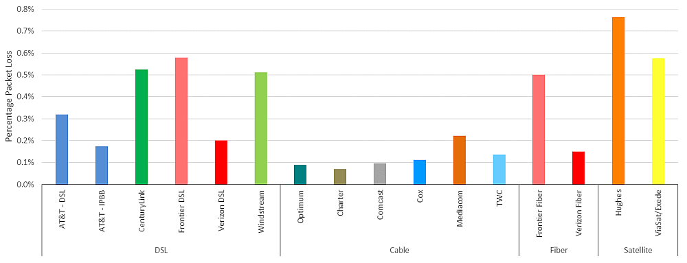
With respect to packet loss, the majority of ISPs show either no change or slight improvement over last year. Exceptions to this include: Hughes whose packet loss increased from 0.2% to 0.8% and Frontier DSL which improved its packet loss from 0.8% to 0.6%.
F. Web browsing performance
The Measuring Broadband America program also conducts a specific test to gauge web browsing performance.
The web browsing test accesses nine popular websites that include text and images but not streaming video. The time required to download a webpage depends on many factors, including the consumer’s download speed within an ISP’s network, the web server’s speed, congestion in other networks outside the consumer’s ISP’s network (if any), and the time required to identify the location of the webserver. Only some of these factors are under control of the consumer’s ISP. Chart 9 displays the average webpage download time by the advertised download speed. As shown by this chart, webpage download time decreases as download speed increases, from about 8 seconds at 1.5 Mbps download speed to about 1.3 seconds for 25 Mbps download speed. Subscribers to service tiers exceeding 25 Mbps do not experience further significant decreases in webpage download times. These download times assume that a single user is using the Internet connection at the time at which the webpage is downloaded, and does not account for more typical scenarios where multiple users within a household are simultaneously using the Internet connection for multiple uses, such as real-time gaming or video streaming.
Chart 9: Average webpage download time, by advertised download speed

3. Methodology
A. Participants
Thirteen ISPs participated in the Fixed Measuring Broadband America program in September 2015.[25] They are:
- AT&T
- CenturyLink
- Charter Communications
- Comcast
- Cox Communications
- Frontier Communications Company
- Hughes Network Systems
- Mediacom Communications Corporation
- Optimum Systems Corporation
- Time Warner Cable
- Verizon
- ViaSat
- Windstream Communications
The methodologies and assumptions underlying the measurements described in this Report are reviewed at meetings that are open to all interested parties, and documented in public ex parte letters filed in the GN Docket No. 12-264. Policy decisions regarding our program involving such things as test periods, mitigation of operational issues, terms of use notifications to panelists, etc. were discussed at these meetings prior to adoption. Participation in this effort is open and voluntary. These discussions include participation of diverse groups representing academia, consumer equipment vendors, telecommunications vendors, network service providers, consumer policy advocates as well as our contractor for this project, SamKnows. In 2015-2016, participants at these meetings (collectively and informally referred to as “the broadband collaborative”), included all thirteen participating ISPs and the following additional organizations:
- Center for Applied Data Analysis (CAIDA)
- International Technology and Trade Associates (ITTA)
- Internet Society
- Level 3 Communications ("Level 3")
- Massachusetts Institute of Technology ("MIT")
- M-Lab
- National Cable & Telecommunications Association ("NCTA")
- New America Foundation
- Practicum Team, NCSU, Institute for Advanced Analytics
- Princeton University
- United States Telecom Association ("US Telecom")
- University of California- Santa Cruz
Participants have contributed importantly to the integrity of this program and provide valuable feedback for FCC decisions on the deployment and ongoing management of this program. Initial proposals for test metrics and testing platforms were discussed and critiqued within the broadband collaborative. M-Lab and Level 3 contributed their core network testing infrastructure, and both parties continue to provide invaluable assistance in helping to define and implement the FCC testing platform. We thank the participants for their continued contributions to this program.
B. Measurement process
The measurements that provide the underlying data in this Report rely both on measurement clients and measurement servers. The measurement clients reside in the homes of 4,281 panelists who receive service by the 13 participating ISPs. The participating ISPs collectively account for over 80% of U.S. residential broadband Internet connections. The panelists closely match the overall state and region statistics of Internet access connections in the United States as reflected in the Commission’s Form 477 data.[26]
The measurement servers are hosted by M-Lab and Level 3 Communications, and are located in nine cities across the United States near a point of interconnection between the ISP’s network and the network on which the measurement server resides.[27]
The measurement clients collect data throughout the year, and this data is available as described below. However, only data collected from September 29-30, October 2-7 and October 10-31, 2015 (referred to throughout this report as the “September 2015” reporting period) are used to generate the charts in this Report.[28]
One of the key factors affecting all aspects of broadband performance is the time of day. At peak hours, more people are attempting to use their broadband Internet connections, giving rise to a greater potential for congestion and degraded user performance. Unless otherwise stated, this Report focuses on performance during peak usage period, which is defined as weeknights between 7:00 PM to 11:00 PM local time. Focusing on peak usage period provides the most useful information because it demonstrates the performance users can expect when the Internet in their local area is experiencing highest demand from users.
Although the Report generally focuses on each participating ISP’s entire service territory, this Report will also briefly address network performance in each of the four census regions of the United States.[29]
Our methodology focuses on the performance of each participating ISP’s network. The metrics discussed in this Report are derived from traffic flowing between a measurement client (located within the modem or router within a panelist’s home) and a measurement server. For each panelist, the tests use the measurement server for which the latency between the measurement client and server is the lowest value. As a result, the metrics measure performance along a specific path within each ISP’s network, through a point of interconnection between the ISP’s network and the network on which the chosen measurement server resides.
However, the service performance that a consumer may experience may differ from our measured values for several reasons. First, as noted, our method depends upon using a specific path to a chosen test server to calculate performance values. On balance, this is a sound approach and is a common method to measure network speeds. ISPs, in general, attempt to maintain consistent performance throughout their network. However, at times specific paths or interconnection points within an ISP’s network may be congested and this can affect a specific consumer’s service. In addition, congestion beyond an ISP’s network, not measured in our study, can affect the overall performance a consumer sees in their service.
Second, a consumer’s home network may be the bottleneck, rather than the ISP’s network. This degradation may occur, for instance, if the home network’s maximum transmission rate is lower than the advertised speed of the selected service tier; if a device is communicating with a Wi-Fi home router at a reduced speed due to walls or obstructions in between the device and the router; if multiple users within the home are currently sharing the total actual speed available; or if there is congestion within the home network due to transfers of data within the home[30]. Due to the increasingly high service tiers now being offered by some ISPs, home network performance is of growing interest to the FCC.
Third, consumers typically view performance through the lens of a set of applications that they utilize. The performance as seen through a particular application depends on both the network performance and on the application performance. While network performance is considered in this Report, application performance is generally not. For instance, if a consumer is web browsing, the delay from a request for a webpage to the display of that webpage includes network latency (considered in this Report), the time it takes for the webserver to respond to the request, and the time it takes for the browser to render that webpage. The latter two components of the total delay are only considered in the Web Browsing test. For other commonly used applications, this Report does not consider components of the application performance that are outside the control of the ISP.
C. Measurement Tests And Performance Metrics
This Report is based on the following measurement tests:
· Download speed: Measures the download speed of each whitebox in 5 second intervals within a 30 second time interval, every 2 hours. The speed measured in the last 5 seconds of the 30 second interval is stored the results of each whitebox are then averaged and the median value of the average speed taken over all the set of whiteboxes is used to determine the “median download speed” for a particular service tier. A weighted median for each service tier (weighted by subscriber counts for the tiers) is used to determine the overall ISP download speed.
· Upload speed: Measures the upload speed of each whitebox in 5 second intervals within a 30 second time interval, every 2 hours. The speed measured in the last 5 seconds of the 30 second interval is stored, the results of each whitebox are then averaged and the median value for the average speed taken over all the set of whiteboxes is used to determine the “median upload speed for a particular service tier. A weighted median for each service tier (weighted by subscriber counts for the tiers) is used to determine the overall ISP upload speed.
· Latency and packet loss: Measures the round-trip times for approximately 2000 packets per hour sent at randomly distributed times. Response times less than 3 seconds are used to determine “median latency.” Acknowledgements not received or received with a round-trip time greater than 3 seconds determine “packet loss.”
· Web browsing: Measures the total time to request and receive webpages (including the text and images on each webpage) from 9 popular websites, every hour. The measurement includes the time required to translate the webpage name into the webserver’s IP address.
This Report focuses on three performance metrics that are of particular relevance to consumers of broadband Internet access service: speed, latency, and packet loss. Download and upload speeds are the primary network performance characteristic advertised by ISPs. Median download speed is the rate at which information can be downloaded by the consumer. Higher speeds indicate a higher delivery rate. However, as discussed above, the performance observed by a user in any given circumstance depends not only on the actual speed of the ISP’s network, but also on the speed of other parts of the Internet and on the speed of the application itself.[31]
The Technical Appendix for the 2016 Report provides specific information regarding the process by which measurements were made and describes each test that was performed.
D. Availability Of Data
The Validated Data Set[32] on which this Report was based, as well as the full results of all tests, are available at http://www.fcc.gov/measuring-broadband-america.
In addition to the Validated Data Set for the September 2015 reference month, in the interest of transparency and to support additional research, raw data for the reference month and other months is available at the same website. Previous reports of the Measuring Broadband America program, as well as the data used to produce them, are also available at the same website.
Both the Commission and SamKnows, the Commission’s contractor for this program, recognize that, while the methodology descriptions included in this document provide an overview of the project as a whole, there will be a number of interested parties—ranging from recognized experts to members of the general public—who would be willing to contribute to the project by reviewing the actual software used in the testing. SamKnows welcomes review of its software and technical platform, consistent with the Commission’s goals of openness and transparency for this program.[33]
4. Test Results
A. Most Popular Advertised Service Tiers
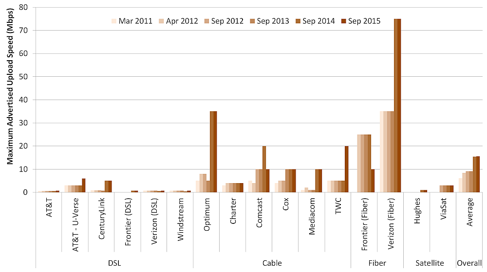
Chart 1 (in section 2.A) above displayed the maximum advertised download speeds among the most popular service tiers for each participating ISP, during the years 2011-2015, grouped by the access technology used to offer the broadband Internet access service (DSL, cable, fiber and satellite). Chart 10 below displays the corresponding maximum advertised upload speeds. In particular, when DSL is used to provide broadband service, the maximum advertised upload speeds among the most popular service tiers has remained generally unchanged since 2011[34]. In contrast, among cable-based broadband providers, the maximum advertised upload speeds among the most popular service tiers increased from 1-5 Mbps in March 2011 to 10-35 Mbps in September 2015.
Chart 10: Maximum advertised upload speed among the most popular service tiers
B. Observed Median Speeds
Chart 3 (in section 2.B) showed the median download speeds experienced by each ISP’s participating subscribers from 2011 to 2015. Chart 11 below shows the corresponding median upload speeds.
The median upload speed this year across all consumers is 9 Mbps, slightly down from 9.5 Mbps last year. This drop is mainly an artifact of the shift in our using weighted median speeds this year instead of unweighted mean speeds (which we used for all previous years) as well as our exclusion of some of the higher service tiers this year due to lack of sufficient panelists. In general, there has been an upward trend in median sustained upload speed of a consumer over all the years from 2011 to 2015.
Chart 11: Median upload speeds by ISP, 2011 to 2015

However, the increases in actual download and upload speeds are not uniform across access technologies. Charts 12.1 and 12.2 show the actual download and upload speeds by technology, from 2011 to 2015.
This year, cable technology median download speeds have increased significantly and the median download speed for cable technology is very close to that for fiber, 49 Mbps vs 52 Mbps. Most recently, the speeds of satellite services have declined as capacity limits are being approached. Future satellite launches are expected to reverse this situation by bringing more capacity to the market through new satellite launches.
We find that over the course of our reports, the annual average increase in download speeds by technology has been 47% for cable, 14% for fiber, 21% for DSL,[34]and -9% for satellite. The corresponding change in upload speeds by technology has been 43% for cable, 25% for fiber, 11% for DSL,[34] and -14% for satellite.
Chart 12.1: Median download speeds by technology, 2011 to 2015

Chart 12.2: Median upload speeds by technology, 2011 to 2015

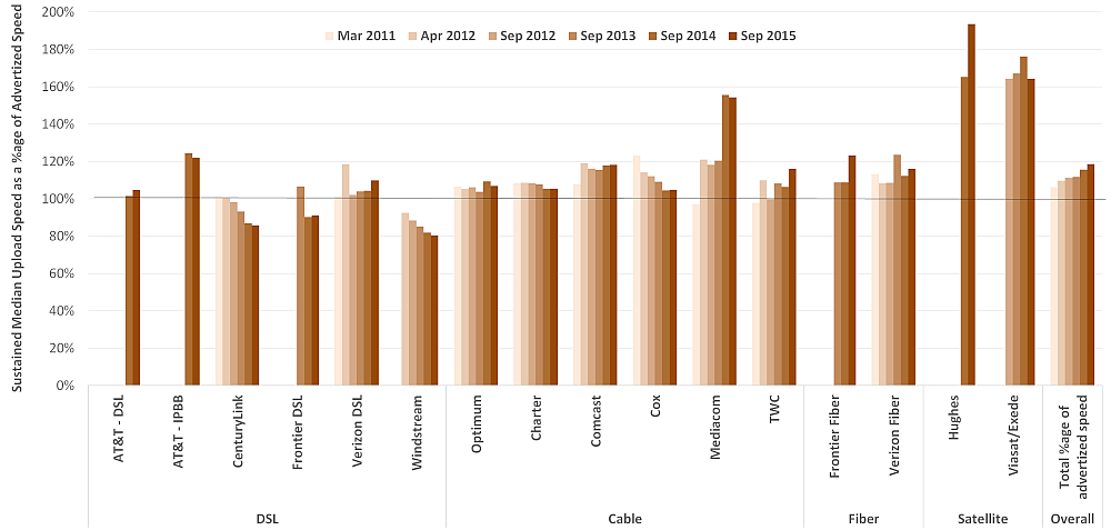
Chart 4 (in section 2.B) showed the ratio in September 2015 of the median speeds of each ISP’s subscribers (across both geography and time) to advertised speeds. Charts 13.1 and 13.2 below show the same ratio for each ISP from 2011 to 2015[35]. The median speeds of most ISPs’ subscribers (across both geography and time) have been close to, or have exceeded, the advertised speeds during most of this time period. However, as noted above, some DSL broadband ISPs continue to advertise “up-to” speeds that on average exceed the actual speeds experienced by their subscribers and some satellite services have shown decline in download speeds due to capacity issues.
Chart 13.1: The ratio of median download speed to advertised download speed, 2011 to 2015
Chart 13.2: The ratio of median upload speed to advertised upload speed, 2011 to 2015
C. Variations In Speeds
As noted, median speeds experienced by consumers may vary based on location and time of day. Chart 5 (in section 2.C) showed, for each ISP, the percentage of consumers (across the ISP’s service territory) who experienced a median download speed (over the peak usage period) that was (a) greater than 95%, (b) between 80% and 95%, and (c) less than 80% of the advertised download speed. Chart 14 below shows the corresponding percentage of consumers whose median upload speed fell in each of these ranges.
Chart 14: The percentage of consumers whose median upload speed was (a) greater than 95%, (b) between 80% and 95%, and (c) less than 80% of the advertised upload speed

Even though the median upload speeds experienced by most ISP’s subscribers are close to or exceed the advertised upload speeds, for each ISP there are some subscribers whose median upload speed falls significantly short of the advertised upload speed. Relatively few subscribers to cable, fiber, or satellite broadband service experience such shortfalls. However, the data suggest that most DSL broadband service subscribers often experience median upload speeds that fall substantially short of advertised upload speeds. We note that AT&T IPBB dropped in performance from last year with less than 65% of subscribers receiving upload speeds greater than 95% of advertised speed versus 83% in 2015. In contrast, Verizon DSL performance for subscribers receiving 95% or greater of advertised speed increased from 57% in 2015 to 73% in 2016. It should also be noted that ISPs using cable technology show more consistency in service than fiber based ISPs.
We can learn more about the variation in network performance by separately examining variation across geography and across time. We start by examining the variation across geography within each participating ISP’s service territory. For each ISP, we first calculate the ratio of the median download speed (over the peak usage period) to the advertised download speed for each panelist subscribing to that ISP. We then examine the distribution of this ratio across the ISP’s service territory.
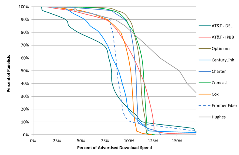
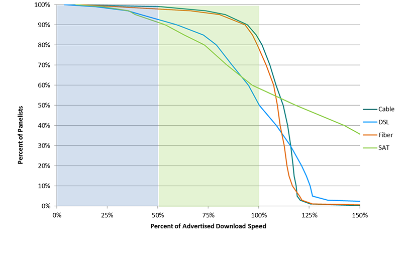
Charts 15.1 and 15.2 show the complementary cumulative distribution of the ratio of median download speed (over the peak usage period) to advertised download speed for each participating ISP. For each ratio of actual to advertised download speed on the horizontal axis, the curves show the percentage of panelists subscribing to each ISP that experienced at least this ratio.[36] For example, the Cox curve in Chart 15.1 shows that 90% of Cox subscribers experienced a median download speed exceeding 78% of the advertised download speed, while 70% experienced a median download speed exceeding 96% of the advertised download speed and 50% experienced a median download speed exceeding 102% of the advertised download speed. Curves that fall steeply around near 100% of the advertised download speed, like that of Cox, indicate that a high percentage of subscribers experience a ratio near 100%. In contrast, curves that fall slowly, like that of AT&T DSL’s download ratio, indicate that there is a wider range of performance within the service territory.
Chart 15.1: Complementary cumulative distribution of the ratio of median download speed to advertised download speed
Chart 15.2: Complementary cumulative distribution of the ratio of median download speed to advertised download speed (continued)
 The curves for cable-based broadband and fiber-based broadband are steeper than those for DSL-based broadband and satellite-based broadband. This can be more clearly seen in Chart 15.3, which plots aggregate curves for each technology. Approximately 80% of subscribers to fiber- and cable-based technologies experience median download speeds exceeding the advertised download speed. In contrast, only approximately 50% of subscribers to DSL-based broadband experience median download speeds exceeding the advertised download speed.[37] In 2015 about 82% of satellite subscribers had median speed performance exceeding advertised speed. This year about 58% of subscribers to satellite-based broadband experience median download speeds exceeding the advertised download speed, a decrease of 24% from 2015.
Chart 15.3 : Complementary cumulative distribution of the ratio of median download speed to advertised download speed, by technology
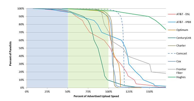
Charts 15.4-15.6 show the complementary cumulative distribution of the ratio of median upload speed (over the peak usage period) to advertised upload speed for each participating ISP (charts 15.4 and 15.5) and by access technology (chart 15.6).
Chart 15.4: Complementary cumulative distribution of the ratio of median upload speed to advertised upload speed
Chart 15.5: Complementary cumulative distribution of the ratio of median upload speed to advertised upload speed (continued)
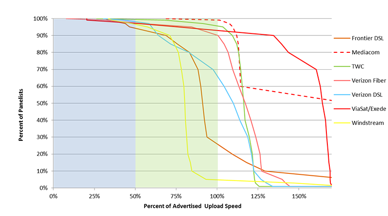
Chart 15.6: Complementary cumulative distribution of the ratio of median upload speed to advertised upload speed, by technology
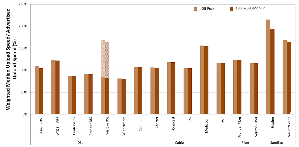
All actual speeds discussed above are measured only during peak usage periods, which for purposes of this Report are defined as weekdays between 7:00 pm and 11:00 pm local time. In contrast, Charts 16.1 and 16.2 compare the ratio of actual speed to advertised speed during peak and off-peak times. Charts 16.1 and 16.2 show that while most ISPs show only a slight degradation from off-peak to peak hour performance, satellite ISPs show a markedly larger degradation. While the performance of most ISPs has remained essentially unchanged from last year there has been a degradation in the performance of satellite ISPs, especially ViaSat whose ratio of weighted median download speed to the advertised download speed has gone down from 107% to 71% during the peak hours. Hughes performance while still exceeding advertised rates has declined from last year’s 203% to 153% this year. This trend is not seen in the upload speeds that have not changed much from last year.
Chart 16.1: The ratio of median download speed to advertised download speed, peak versus off-peak
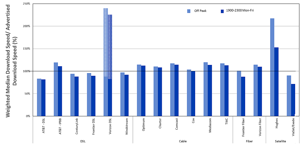
Chart 16.2: The ratio of median upload speed to advertised upload speed, peak versus off-peak
Charts 17.1[38] and 17.2 show the download ratio in each 2 hour time block during weekdays for each ISP. The ratio is lowest during the busiest 4 hour time block (7:00 PM – 11:00 PM).
Chart 17.1: The ratio of median download speed to advertised download speed, M-F 2 hour time blocks, terrestrial ISPs
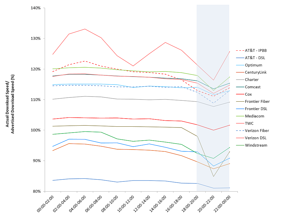
Chart 17.2: The ratio of median download speed to advertised download speed, M-F 2 hour time blocks, satellite ISPs
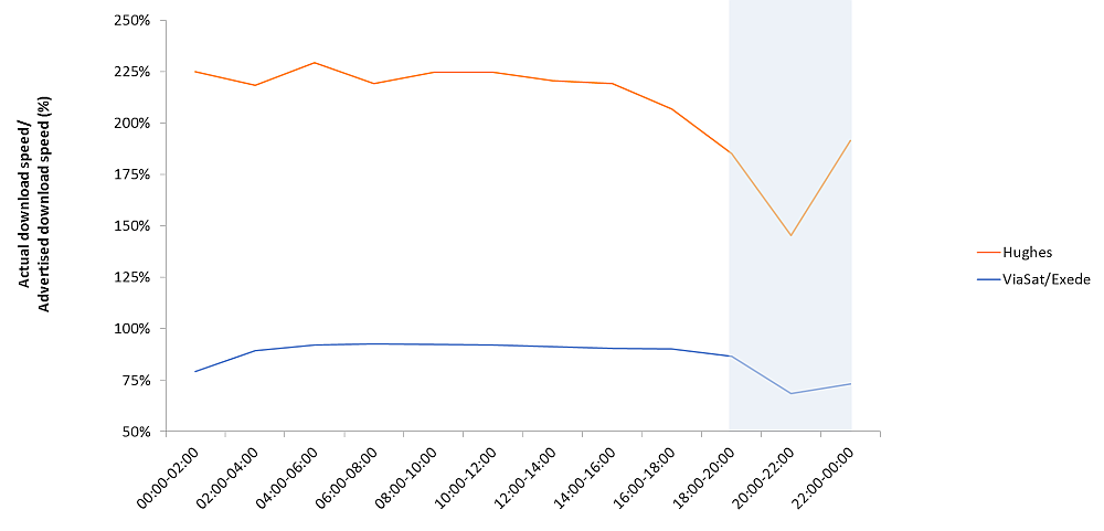
Chart 6 (in section 2.C) Illustrated, for each ISP, the ratio of median download speed that was experienced by at least 80% of panelists for at least 80% of the peak usage period (“80/80 consistent download speed”) to advertised download speed, and for reference the ratio of median download speed to advertised download speed shown previously in Chart 4. We expand on the theme of consistent speed in the following charts.
Chart 18.1 illustrates information for 80/80 consistent upload speed. The results for this year are quite similar to that of last year.
Chart 18.1: The ratio of 80/80 consistent upload speed to advertised upload speed.

Charts 18.2 and 18.3 illustrate similar consistency metrics for 70/70 consistent speeds, i.e., the actual speed experienced by at least 70% of panelists during at least 70% of the peak usage period. The ratios for 70/70 consistent speeds are higher than the corresponding ratios for 80/80 consistent speeds. In fact, for many ISPs, the 70/70 consistent download speed is close to or in one case (Frontier- fiber) higher than the advertised download speed.
Chart 18.2: The ratio of 70/70 consistent download speed to advertised download speed.
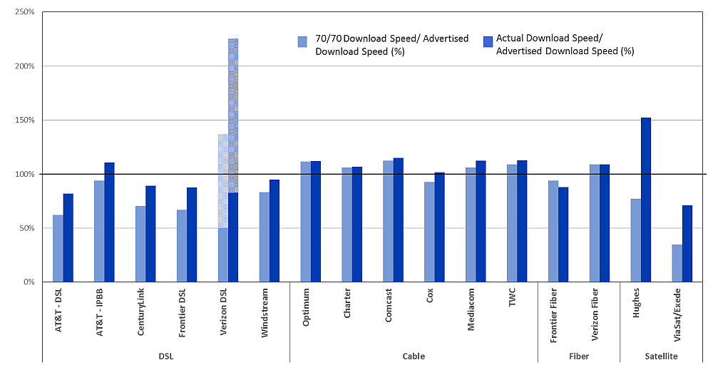
Chart 18.3: The ratio of 70/70 consistent upload speed to advertised upload speed.

Chart 19 shows the variations among the four U.S. census regions (Northeast, South, Midwest, and West) in the advertised download speed and median download speed, weighted amongst panelists in each region.[39] While no single technology was the fastest in all regions, for cable- and fiber- based broadband, both the average advertised download speed and the average median download speed among the most popular service tiers exceeded 25 Mbps in each region.
Chart 19: Advertised download speed and median download speed, by region and by technology

D. Latency
Chart 7 (in section 2.D) illustrates the weighted median latency for each participating ISP. We observed that weighted median latency depends primarily on the technology used by the ISP. Chart 20 below shows the weighted median latency, by technology and by advertised download speed. For a given technology, latency varies little with advertised download speed. Latency metrics continue with roughly the same distribution pattern as last year. DSL service has typically higher latency than cable and fiber (as seen in Chart 7 as well). Due to the large differences in latencies of more than a magnitude between satellite and terrestrial technologies, the results for each class of technology are shown in separate charts for scaling purposes. The results for satellite ISPs are shown in Chart 7b.
Chart 20: Latency for Terrestrial ISPs, by technology and by advertised download speed

5. Additional test results
A. Actual Speed, By Service Tier
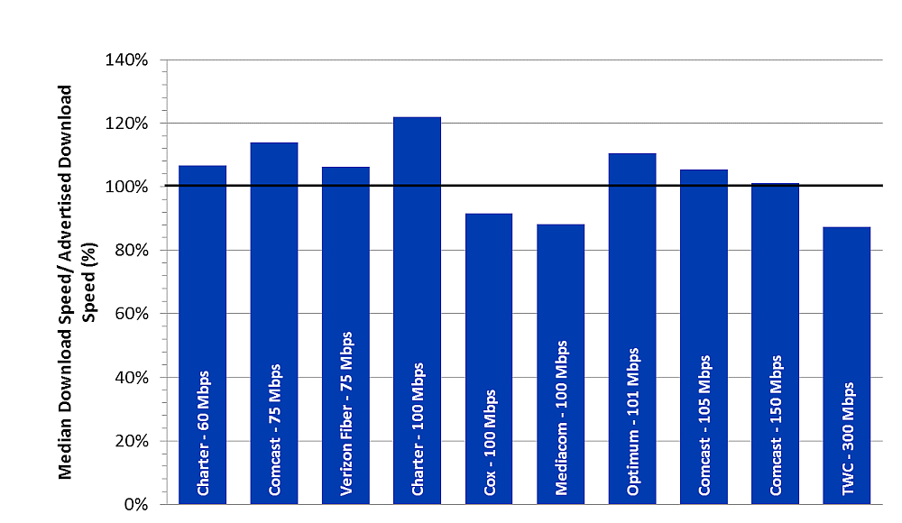
As shown in Charts 21.1-21.6, peak usage period performance varied by service tier among ISPs included in this study during the September 2015 test period. On average, during peak periods, the ratio of median download speed to advertised download speed for all ISPs are 71% or better, and 90% or better for the majority of ISPs. However, the ratio of median download speed to advertised download speed varies among service tiers. It should be noted that for Verizon-DSL, which advertises a range of speeds, we have calculated a range a values corresponding to their advertised range[40].
Chart 21.1: The ratio of median download speed to advertised download speed, by ISP (0-5 Mbps)
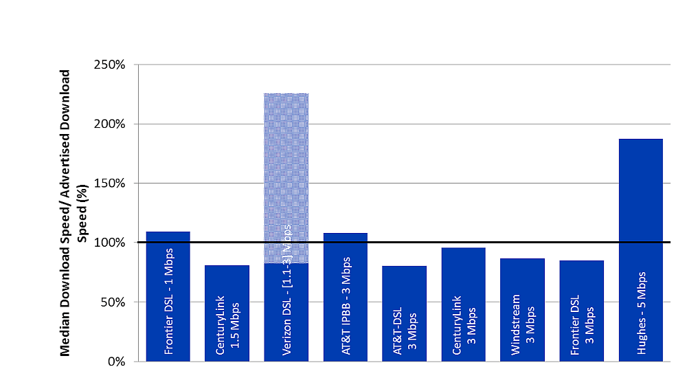
Chart 21.2: The ratio of median download speed to advertised download speed, by ISP (6-10 Mbps)

Chart 21.3: The ratio of median download speed to advertised download speed, by ISP (12-15 Mbps)

Chart 21.4: The ratio of median download speed to advertised download speed, by ISP (18-25 Mbps)
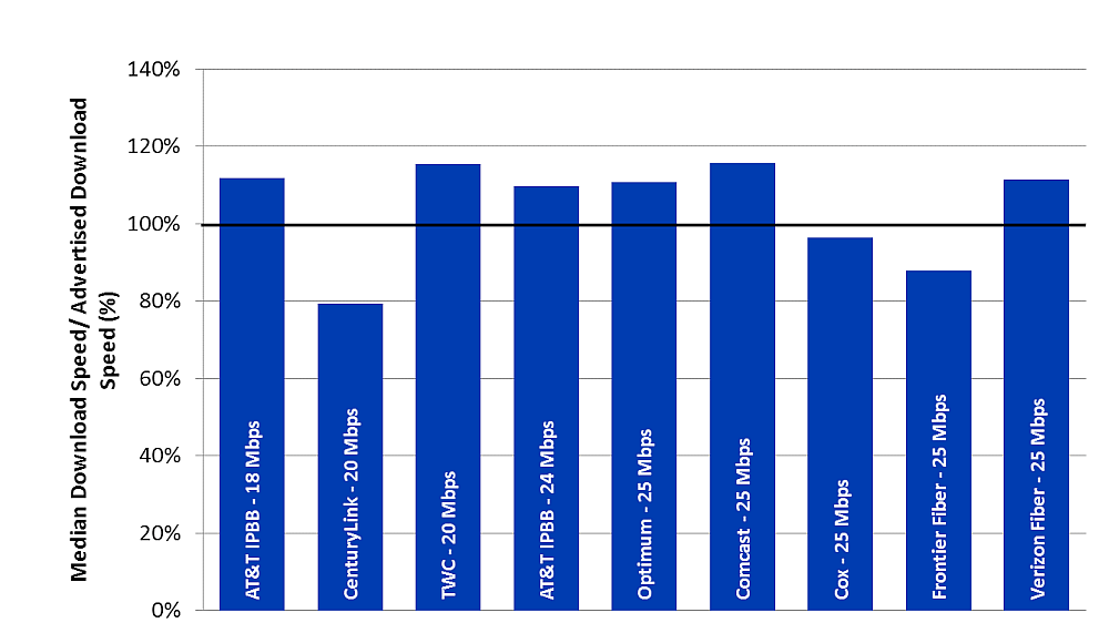
Chart 21.5: The ratio of median download speed to advertised download speed, by ISP (30-50 Mbps)

Chart 21.6: The ratio of median download speed to advertised download speed, by ISP (60-300 Mbps)
Charts 22.1 –22.5 depict the ratio of median upload speeds to advertised upload speeds for each ISP by service tier.
Chart 22.1: The ratio of median upload speed to advertised upload speed, by ISP (0.256-0.64 Mbps)

Chart 22.2: The ratio of median upload speed to advertised upload speed, by ISP (0.768-1.5 Mbps)
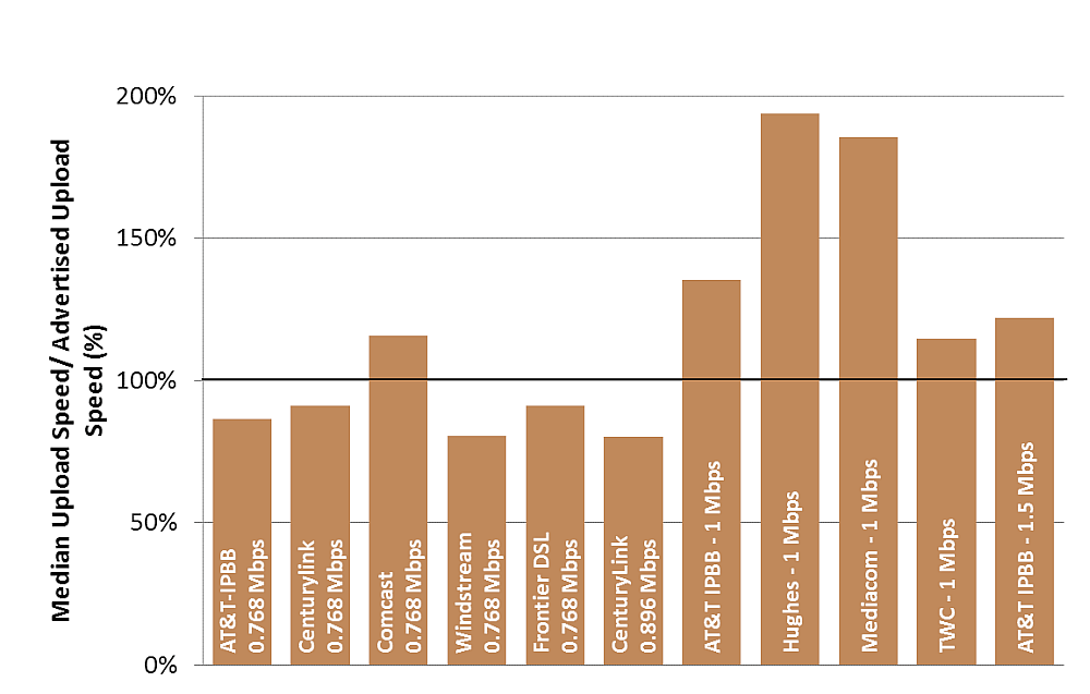
Chart 22.3: The ratio of median upload speed to advertised upload speed, by ISP (2-5 Mbps)
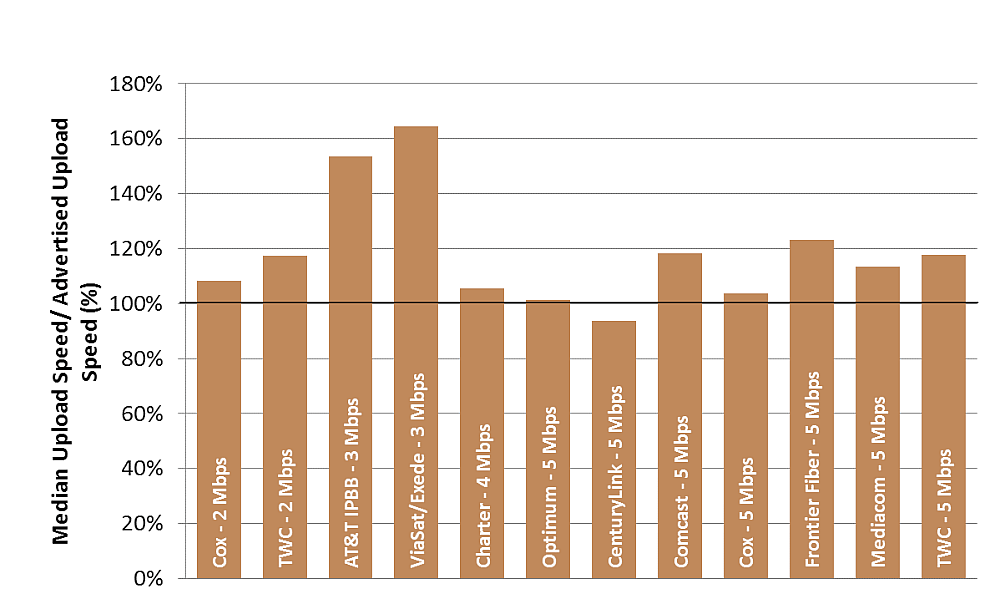
Chart 22.4: The ratio of median upload speed to advertised upload speed, by ISP (6-10 Mbps)

Chart 22.5: The ratio of median upload speed to advertised upload speed, by ISP (20-75 Mbps)

Table 2 lists the advertised download service tiers included in this study, and compares this with the ISP’s median download speed results. As before, we note that the median download speeds listed here are based on national averages, and may not represent the performance experienced by any particular consumer at any given time or place.
Table 2: Peak Period Median download speed, by ISP
|
Advertised Download Speed (Mbps) |
ISP |
Actual Speed / Advertised Speed |
|
|
1.09 |
1 |
Frontier DSL |
109.16% |
|
1.22 |
1.5 |
CenturyLink |
81.08% |
|
2.48 |
1.1 - 3 |
Verizon DSL |
120.98% (98.21% - 157.46%) |
|
2.42 |
3 |
AT&T DSL |
80.71% |
|
3.24 |
3 |
AT&T IPBB |
108.05% |
|
2.88 |
3 |
CenturyLink |
95.87% |
|
2.6 |
3 |
Windstream |
86.52% |
|
2.55 |
3 |
Frontier DSL |
85.16% |
|
9.37 |
5 |
Hughes |
187.34% |
|
6.59 |
6 |
AT&T IPBB |
109.81% |
|
4.93 |
6 |
AT&T DSL |
82.24% |
|
5.85 |
6 |
Windstream |
97.54% |
|
5.48 |
6 |
Frontier DSL |
91.34% |
|
9.14 |
10 |
CenturyLink |
91.45% |
|
13.58 |
10 |
Hughes |
135.85% |
|
13.81 |
12 |
AT&T IPBB |
115.11% |
|
11.12 |
12 |
CenturyLink |
92.64% |
|
11.97 |
12 |
Windstream |
99.71% |
|
8.56 |
12 |
ViaSat |
71.34% |
|
15.68 |
15 |
Cox |
104.52% |
|
18.44 |
15 |
Mediacom |
122.94% |
|
16.82 |
15 |
TWC |
112.15% |
|
20.15 |
18 |
AT&T IPBB |
111.93% |
|
15.87 |
20 |
CenturyLink |
79.36% |
|
23.11 |
20 |
TWC |
115.54% |
|
26.3 |
24 |
AT&T IPBB |
109.58% |
|
27.68 |
25 |
Optimum |
110.72% |
|
28.90 |
25 |
Comcast |
115.58% |
|
24.12 |
25 |
Cox |
96.47% |
|
21.95 |
25 |
Frontier Fiber |
87.80% |
|
27.82 |
25 |
Verizon Fiber |
111.28% |
|
35.24 |
30 |
TWC |
117.48% |
|
34.15 |
40 |
CenturyLink |
85.38% |
|
41.64 |
45 |
AT&T IPBB |
92.53% |
|
57.1 |
50 |
Optimum |
114.19% |
|
57.56 |
50 |
Comcast |
115.12% |
|
51.15 |
50 |
Cox |
102.30% |
|
52.37 |
50 |
Mediacom |
104.73% |
|
56.43 |
50 |
TWC |
112.87% |
|
55.41 |
50 |
Verizon Fiber |
110.81% |
|
64.02 |
60 |
Charter |
106.70% |
|
85.38 |
75 |
Comcast |
113.83% |
|
79.74 |
75 |
Verizon Fiber |
106.32% |
|
121.96 |
100 |
Charter |
121.96% |
|
91.67 |
100 |
Cox |
91.67% |
|
88.2 |
100 |
Mediacom |
88.20% |
|
111.56 |
101 |
Optimum |
110.46% |
|
110.81 |
105 |
Comcast |
105.53% |
|
151.65 |
150 |
Comcast |
101.10% |
|
262.35 |
300 |
TWC |
87.45% |
B. Variations In Speed
Variations In SpeedIn Section 3.C, we presented speed consistency metrics for each ISP based on test results averaged across all service tiers. In the present section, we provide the detailed results for each individual service tier of each ISP. Consistency of speed is important for services such as video streaming that have grown in popularity and now make up the majority of Internet traffic. A significant diminution in speed over a period of time can force a reduction in video resolution or an intermittent loss of service.
This year, ViaSat/Exede showed a significant drop in the consistency of speed with over 75% of consumers experiencing an average service speed of 80% or less of advertised speed. ISPs using DSL technology also show higher impairments in delivering advertised service rates, primarily driven by the nature of DSL; i.e., performance varies by the length of the customer’s local loop and most ISPs quote a single ‘up-to’ speed associated with their service.
Cable companies, in general, show a high consistency of service. However, with the introduction of very high speed service tiers, those above 100 Mbps, service consistency seems to be at a lower level. Fiber based systems, in general, have a fairly high level of service consistency.
Chart 23.1: The percentage of consumers whose median download speed was (a) greater than 95%, (b) between 80% and 95%, and (c) less than 80% of the advertised download speed, by service tier
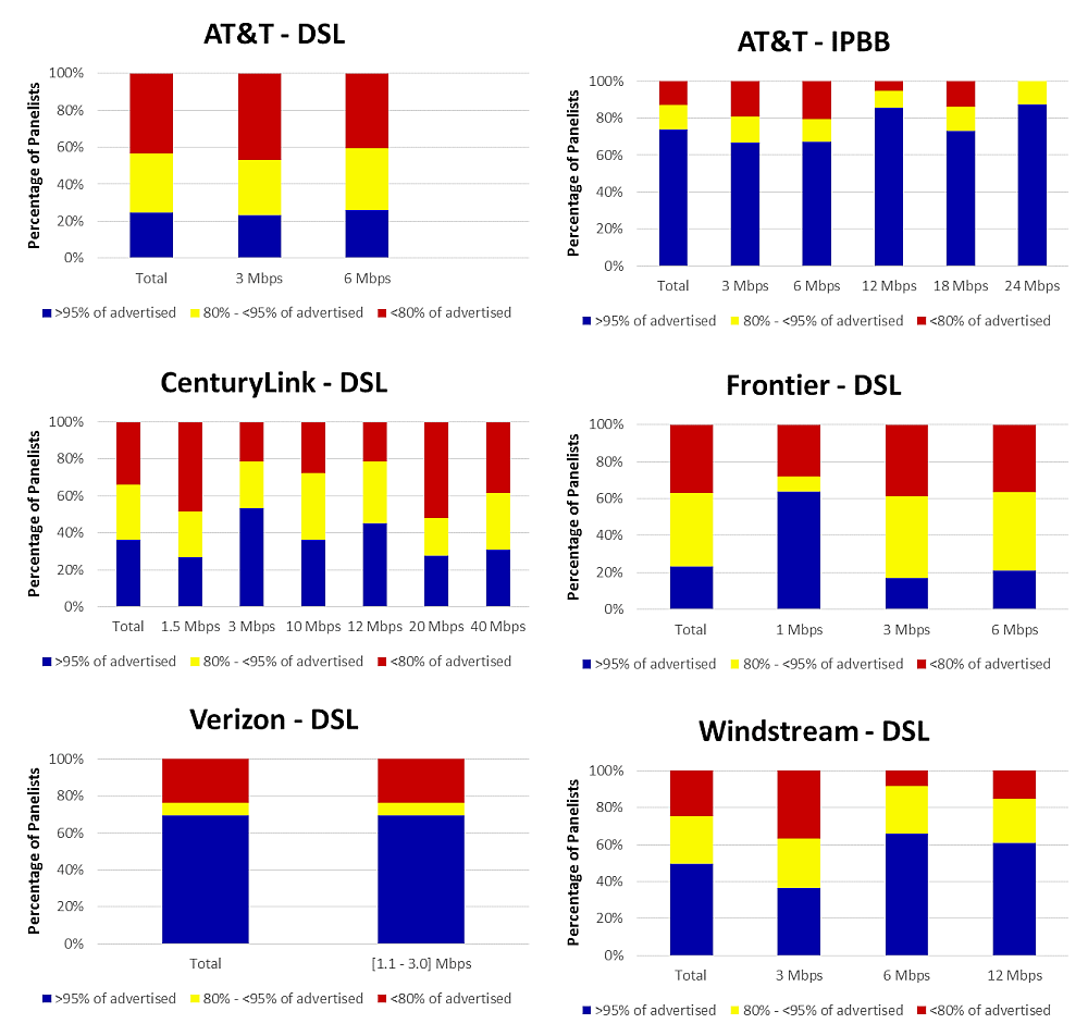
Chart 23.2: The percentage of consumers whose median download speed was (a) greater than 95%, (b) between 80% and 95%, and (c) less than 80% of the advertised download speed (continued).
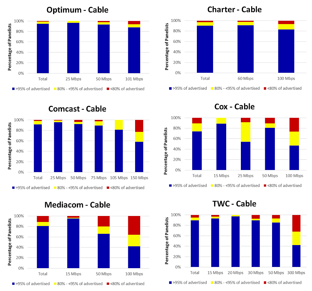
Chart 23.3: The percentage of consumers whose median download speed was (a) greater than 95%, (b) between 80% and 95%, and (c) less than 80% of the advertised download speed (continued).

Chart 24.1: The percentage of consumers whose median upload speed was (a) greater than 95%, (b) between 80% and 95%, and (c) less than 80% of the advertised upload speed.

Chart 24.2: The percentage of consumers whose median upload speed was (a) greater than 95%, (b) between 80% and 95%, and (c) less than 80% of the advertised upload speed (continued).
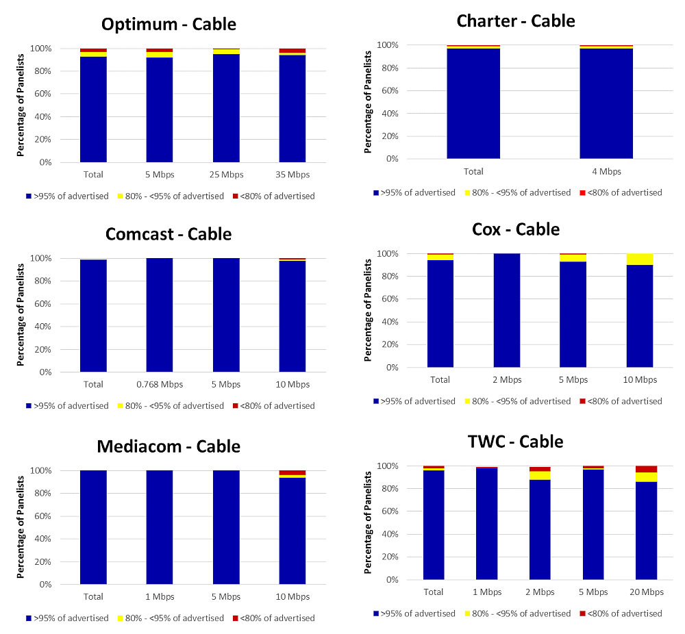
Chart 24.3: The percentage of consumers whose median upload speed was (a) greater than 95%, (b) between 80% and 95%, and (c) less than 80% of the advertised upload speed (continued).
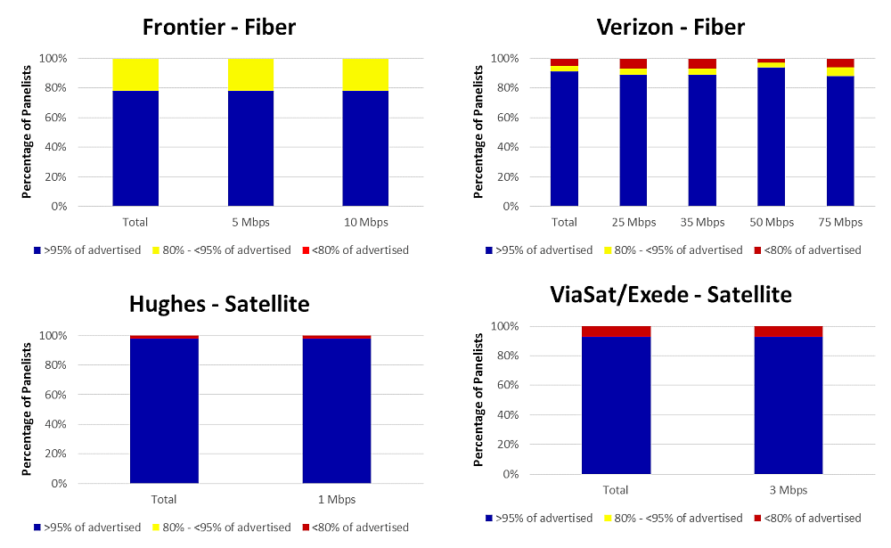
In Section 3.C, we presented complementary cumulative distributions for each ISP based on test results across all service tiers. In the present section, we provide tables showing selected points on these distributions by each individual ISP and technology. Overall performance is less dependent on a specific technology and more on the engineering and marketing choices made by each company. For example, Optimum and Charter, which are cable based companies, provided average download speeds over 95% and 85% respectively of advertised rates to 95% of their panelists. Cox and Mediacom, also cable companies, provided median speeds of at least 61% of advertised to 95% of their panelists. Verizon fiber based service provided speeds of 81% or better to 95% of their panelists whereas Frontier Fiber provided speeds of 60% or better to 95% of their panelists. Performance depends upon a number of factors: technology characteristics, operational proficiency of the ISP, specific service tiers chosen to be offered, etc.
Table 3: Complementary cumulative distribution of the ratio of median download speed to advertised download speed, by technology, by ISP
|
ISP |
20% |
50% |
70% |
80% |
90% |
95% |
|
AT&T (IPBB) |
123% |
111% |
98% |
89% |
76% |
51% |
|
AT&T (DSL) |
100% |
82% |
74% |
47% |
34% |
18% |
|
Optimum |
115% |
112% |
108% |
105% |
100% |
95% |
|
CenturyLink |
99% |
89% |
78% |
69% |
54% |
42% |
|
Charter |
109% |
107% |
104% |
102% |
95% |
85% |
|
Comcast |
117% |
115% |
110% |
105% |
97% |
90% |
|
Cox |
105% |
102% |
96% |
92% |
78% |
61% |
|
Frontier Fiber |
94% |
88% |
85% |
83% |
80% |
60% |
|
Frontier DSL |
96% |
87% |
77% |
67% |
45% |
33% |
|
Hughes |
190% |
153% |
118% |
103% |
86% |
59% |
|
Mediacom |
125% |
113% |
105% |
97% |
75% |
61% |
|
TWC |
117% |
113% |
108% |
103% |
94% |
78% |
|
Verizon Fiber |
114% |
109% |
104% |
99% |
93% |
81% |
|
Verizon DSL (Mid-Range) |
134% |
121% |
88% |
78% |
60% |
45% |
|
ViaSat/Exede |
83% |
71% |
58% |
47% |
36% |
31% |
|
Windstream |
100% |
95% |
83% |
72% |
51% |
36% |
Table 4: Complementary cumulative distribution of the ratio of median upload speed to advertised upload speed, by technology, by ISP
|
ISP |
20% |
50% |
70% |
80% |
90% |
95% |
|
AT&T (IPBB) |
133% |
121% |
92% |
87% |
63% |
54% |
|
AT&T (DSL) |
122% |
102% |
77% |
70% |
61% |
55% |
|
Optimum |
114% |
104% |
101% |
101% |
98% |
94% |
|
CenturyLink |
94% |
87% |
80% |
77% |
69% |
57% |
|
Charter |
106% |
105% |
105% |
104% |
101% |
97% |
|
Comcast |
119% |
118% |
118% |
117% |
115% |
111% |
|
Cox |
107% |
104% |
103% |
103% |
100% |
93% |
|
Frontier Fiber |
152% |
118% |
100% |
95% |
92% |
92% |
|
Frontier DSL |
109% |
91% |
88% |
83% |
69% |
46% |
|
Hughes |
213% |
194% |
174% |
163% |
149% |
118% |
|
Mediacom |
187% |
181% |
114% |
113% |
112% |
110% |
|
TWC |
122% |
116% |
114% |
113% |
109% |
104% |
|
Verizon Fiber |
126% |
117% |
110% |
107% |
101% |
85% |
|
Verizon DSL (Mid-Range) |
121% |
110% |
98% |
83% |
64% |
60% |
|
ViaSat/Exede |
168% |
164% |
161% |
144% |
135% |
76% |
|
Windstream |
82% |
80% |
78% |
76% |
71% |
57% |
As discussed in prior Reports, some cable ISPs offer “burst speed” techniques which temporarily allocate more bandwidth to a consumer’s service. The effect is temporary—typically lasting less than 15 to 20 seconds—and may be reduced by other broadband activities occurring within the consumer household.[41] Burst speed is not equivalent to actual speed, and may be more useful with certain applications than with others. For example, large file transfers, video streaming, and video chat require the transfer of large amounts of information over sustained periods of time. However, other activities require the transfer of moderate amounts of information in a short interval of time, and may benefit from burst speed techniques.
Comparing burst download speeds to median download speeds demonstrates the effect that burst services can have on data throughput. To test for the possible effect of burst technology, we compare the median download speed in the first five seconds of a speed test to the median download speed in the last five seconds of a total 30 second test. Large differences may indicate the use of burst technology, while smaller differences are likely the effect of variable packet performance.
We have tracked this metric from the inception of these reports. As broadband speeds have increased, the measurable impact of using this burst technique has diminished. Correspondingly, only two ISPs (Cox and Mediacom) use this technique now. Therefore, similar to last year we have restricted the results to only those two participating ISPs that have affirmed that they are still using burst technology. Chart 25 shows burst download speed results.[42] Mediacom’s 15 Mbps advertised download service tier showed a 27% increase from median download speed to burst download speed, and Cox’s 25 Mbps and 50 Mbps advertised download service tiers showed 14% and 13% increases from median download speed to burst download speed. These figures were essentially the same as last year. Other tiers offered by these broadband providers showed less than a 10% increase.
Chart 25: Peak Period Burst Download Speeds as a Percentage Increase over Median Download Speeds, by ISP (where tiers showed a greater than 10% Increase)

The use of burst speed techniques on uploads is even less prevalent. Due to this decline in the use of burst speed technology, we plan to discontinue reporting on it for future reports.
C. Web Browsing Performance, By Service Tier
In the present section we provide the detailed results of the webpage download time for each individual service tier of each ISP. Generally, results demonstrate that website loading time for lower tiers up to 15 Mbps experience more significant differences in webpage loading time than tiers above 15 Mbps. In general, webpage loading times do not significantly improve if a user subscribes to a tier with speeds higher than 15 Mbps.
Chart 26.1: Average webpage download time, by ISP (1-3 Mbps)

Chart 26.2: Average webpage download time, by ISP (5-10 Mbps)

Chart 26.3: Average webpage download time, by ISP (12-15 Mbps)
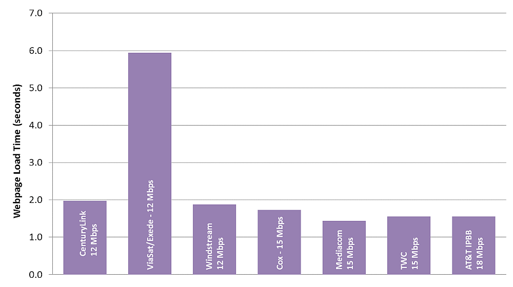
Chart 26.4: Average webpage download time, by ISP (18-25 Mbps)

Chart 26.5: Average webpage download time, by ISP (30-50 Mbps)
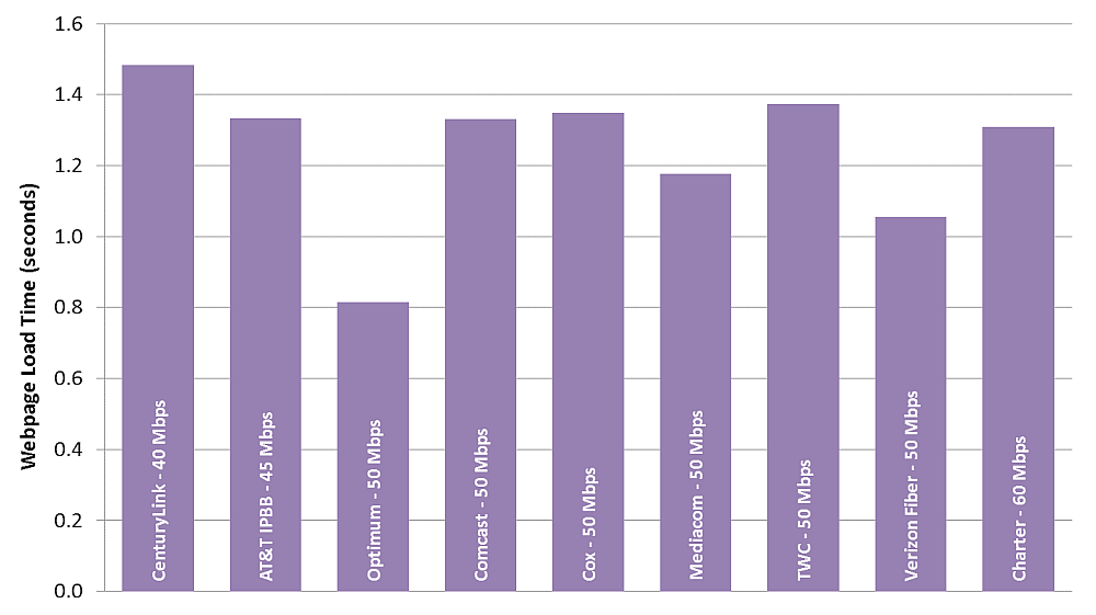
Chart 26.6: Average webpage download time, by ISP (60-300 Mbps)
D. Methodology And Sampling Plan For Statewide Statistics
The program’s methodology and sampling plan is designed to measure ISP performance by census region in order to provide statistics at a national level. While the sampling plan was not designed to provide first order inferences by region or state geography, in some cases the subscriber counts and data do support some aggregated statistics by technology and region, and statistics by state. In order to calculate statistics for more specific levels of regional and state geography, measurements must be aggregated across ISPs and technologies to ensure that an adequate number of measurements are available. Table 5 displays the aggregate performance of all ISPs and technologies across all service tiers in 2015. However, as Table 6 indicates, some states do not have a sufficient number of samples and are excluded. For states with sufficient number of aggregated samples, Table 5 shows the Weighted Median Download Speed and the Weighted Median Tier Speed (computed from all advertised download speeds). The Total Sample Count shows the total number of subscribers for the State, and the cable, DSL, fiber, and satellite columns show the number of subscribers for a given technology, respectively.
Table 5: Statewide Download Speed with Sample Size by Technology
|
State |
Median Download Speed (Mbps) |
Median Tier Speed (Mbps) |
Sample Size |
||||
|
TOTAL |
Subdivided by Technology |
||||||
|
Cable |
DSL |
Fiber |
Satellite |
||||
|
AL |
26.7 |
25.8 |
44 |
20 |
20 |
0 |
4 |
|
AR |
20.3 |
20.3 |
35 |
7 |
24 |
0 |
4 |
|
AZ |
37.3 |
39.2 |
125 |
89 |
36 |
0 |
1 |
|
CA |
41.6 |
40.0 |
411 |
220 |
156 |
28 |
8 |
|
CO |
45.9 |
46.3 |
114 |
75 |
36 |
1 |
2 |
|
CT |
41.9 |
41.7 |
66 |
62 |
3 |
1 |
0 |
|
FL |
36.8 |
37.1 |
171 |
103 |
49 |
15 |
4 |
|
GA |
35.0 |
31.6 |
123 |
63 |
59 |
0 |
1 |
|
IA |
33.4 |
31.8 |
52 |
41 |
11 |
0 |
0 |
|
IL |
42.9 |
37.5 |
215 |
144 |
69 |
0 |
2 |
|
IN |
35.3 |
31.1 |
98 |
61 |
35 |
0 |
2 |
|
KS |
24.7 |
24.1 |
26 |
12 |
14 |
0 |
1 |
|
KY |
21.1 |
18.9 |
87 |
56 |
28 |
1 |
2 |
|
LA |
43.4 |
42.3 |
37 |
23 |
10 |
0 |
4 |
|
MA |
43.2 |
40.1 |
107 |
74 |
5 |
25 |
3 |
|
MD |
44.6 |
40.3 |
64 |
22 |
2 |
40 |
0 |
|
MI |
41.9 |
38.2 |
174 |
89 |
79 |
0 |
6 |
|
MN |
44.8 |
43.2 |
102 |
73 |
29 |
0 |
0 |
|
MO |
22.3 |
21.7 |
61 |
13 |
43 |
0 |
5 |
|
NC |
35.9 |
32.5 |
116 |
76 |
39 |
0 |
1 |
|
NE |
29.8 |
36.3 |
25 |
19 |
5 |
0 |
0 |
|
NH |
43.1 |
41.4 |
27 |
26 |
0 |
0 |
1 |
|
NJ |
50.3 |
45.8 |
134 |
90 |
6 |
38 |
0 |
|
NM |
45.8 |
49.1 |
47 |
35 |
12 |
0 |
0 |
|
NV |
36.8 |
35.2 |
258 |
17 |
12 |
0 |
0 |
|
NY |
39.7 |
36.8 |
244 |
175 |
22 |
45 |
3 |
|
OH |
21.9 |
19.6 |
152 |
94 |
55 |
0 |
3 |
|
OK |
25.4 |
25.2 |
42 |
16 |
24 |
0 |
2 |
|
OR |
49.1 |
46.1 |
77 |
57 |
17 |
2 |
1 |
|
PA |
37.1 |
33.8 |
124 |
71 |
25 |
27 |
1 |
|
SC |
31.1 |
29.3 |
54 |
30 |
23 |
0 |
1 |
|
TN |
41.8 |
38.5 |
86 |
52 |
34 |
0 |
1 |
|
TX |
35 |
32.9 |
251 |
92 |
138 |
18 |
2 |
|
UT |
51.7 |
52.2 |
34 |
28 |
6 |
0 |
0 |
|
VA |
43.2 |
41.1 |
144 |
66 |
13 |
62 |
3 |
|
WA |
48.2 |
47.0 |
147 |
113 |
31 |
1 |
3 |
|
WI |
31.3 |
28.4 |
118 |
70 |
51 |
0 |
6 |
Table 6: States with Low Sample Counts
|
2015 |
Count |
|
DC |
7 |
|
DE |
6 |
|
HI |
9 |
|
ID |
13 |
|
ME |
13 |
|
MS |
12 |
|
MT |
4 |
|
ND |
2 |
|
RI |
9 |
|
SD |
4 |
|
VT |
10 |
|
WV |
6 |
|
WY |
2 |
In order to provide statistical background for the availability of technologies by state, Table 7 reproduces Form 477 statistics on the availability of particular broadband speeds for states, regions and technologies published in Table 16 of the October 2014 Internet Access Services Report.[43]
Table 7: Form 477 Statistics for Connections by Technology by State as of December 31, 2014 for States in Figures 33 and 34 (connections over 200 kbps in at least one direction, in thousands)
|
State |
ADSL Percent of Total |
SDSL Percent of Total |
Cable Modem Percent of Total |
Fiber Percent of Total |
ADSL |
SDSL |
Cable Modem |
Fiber |
Total |
|
Alabama |
11.22% |
0.06% |
14.89% |
0.55% |
529 |
3 |
702 |
26 |
4,713 |
|
Alaska |
9.27% |
0.12% |
* |
0.36% |
78 |
1 |
* |
3 |
841 |
|
Arizona |
9.55% |
* |
19.45% |
0.84% |
635 |
# |
1,293 |
56 |
6,647 |
|
Arkansas |
12.07% |
* |
12.14% |
0.49% |
347 |
# |
349 |
14 |
2,874 |
|
California |
9.04% |
0.03% |
14.83% |
2.10% |
3,931 |
13 |
6,450 |
915 |
43,487 |
|
Colorado |
10.47% |
* |
17.19% |
1.79% |
632 |
# |
1,038 |
108 |
6,038 |
|
Connecticut |
0.68% |
* |
22.25% |
* |
28 |
* |
915 |
* |
4,112 |
|
Florida |
9.11% |
0.00% |
20.71% |
2.83% |
1,867 |
1 |
4,245 |
581 |
20,497 |
|
Georgia |
11.27% |
0.01% |
16.00% |
0.74% |
1,150 |
1 |
1,632 |
76 |
10,202 |
|
Hawaii |
* |
0.12% |
* |
1.12% |
* |
2 |
* |
18 |
1,601 |
|
Idaho |
11.92% |
* |
12.41% |
1.78% |
194 |
# |
202 |
29 |
1,628 |
|
Illinois |
9.15% |
0.02% |
17.52% |
0.31% |
1,281 |
3 |
2,452 |
43 |
13,996 |
|
Indiana |
10.28% |
0.02% |
16.05% |
1.34% |
666 |
1 |
1,040 |
87 |
6,480 |
|
Iowa |
10.92% |
0.03% |
14.05% |
3.54% |
345 |
1 |
444 |
112 |
3,160 |
|
Kansas |
9.62% |
* |
16.21% |
3.14% |
282 |
# |
475 |
92 |
2,930 |
|
Kentucky |
8.97% |
0.02% |
12.18% |
1.10% |
482 |
1 |
655 |
59 |
5,376 |
|
Louisiana |
8.88% |
* |
14.60% |
1.16% |
438 |
# |
720 |
57 |
4,930 |
|
Maine |
10.05% |
0.15% |
25.47% |
0.52% |
135 |
2 |
342 |
7 |
1,343 |
|
Maryland |
* |
0.02% |
14.74% |
* |
* |
1 |
974 |
* |
6,607 |
|
Massachusetts |
* |
0.01% |
21.90% |
* |
* |
1 |
1,694 |
* |
7,734 |
|
Michigan |
8.84% |
0.04% |
20.14% |
0.14% |
874 |
4 |
1,992 |
14 |
9,889 |
|
Minnesota |
9.53% |
0.07% |
16.82% |
1.80% |
561 |
4 |
990 |
106 |
5,885 |
|
Mississippi |
11.40% |
* |
10.43% |
0.22% |
317 |
* |
290 |
6 |
2,780 |
|
Missouri |
12.98% |
* |
12.53% |
1.54% |
815 |
# |
787 |
97 |
6,279 |
|
Montana |
11.55% |
0.10% |
17.08% |
1.58% |
117 |
1 |
173 |
16 |
1,013 |
|
Nebraska |
8.66% |
* |
19.01% |
2.01% |
164 |
# |
360 |
38 |
1,894 |
|
Nevada |
8.47% |
* |
20.60% |
0.27% |
250 |
# |
608 |
8 |
2,952 |
|
New Hampshire |
6.08% |
* |
27.21% |
1.31% |
88 |
# |
394 |
19 |
1,448 |
|
New Jersey |
2.48% |
0.01% |
18.18% |
* |
266 |
1 |
1,949 |
* |
10,721 |
|
New Mexico |
14.90% |
* |
12.27% |
0.77% |
289 |
# |
238 |
15 |
1,939 |
|
New York |
2.68% |
0.03% |
20.70% |
* |
584 |
6 |
4,506 |
* |
21,767 |
|
North Carolina |
10.23% |
* |
19.16% |
0.77% |
1,014 |
# |
1,899 |
76 |
9,909 |
|
North Dakota |
7.63% |
0.12% |
15.86% |
7.02% |
63 |
1 |
131 |
58 |
826 |
|
Ohio |
9.50% |
0.01% |
19.22% |
0.90% |
1,144 |
1 |
2,316 |
109 |
12,048 |
|
Oklahoma |
9.91% |
* |
13.83% |
0.68% |
392 |
# |
547 |
27 |
3,954 |
|
Oregon |
7.48% |
0.02% |
19.61% |
1.23% |
317 |
1 |
831 |
52 |
4,238 |
|
Pennsylvania |
6.00% |
0.02% |
18.72% |
* |
798 |
2 |
2,488 |
* |
13,290 |
|
South Carolina |
10.17% |
* |
18.00% |
1.42% |
473 |
# |
837 |
66 |
4,651 |
|
South Dakota |
7.01% |
* |
18.50% |
5.08% |
58 |
* |
153 |
42 |
827 |
|
Tennessee |
8.74% |
0.06% |
16.23% |
2.12% |
568 |
4 |
1,055 |
138 |
6,500 |
|
Texas |
10.42% |
0.01% |
11.78% |
2.32% |
2,930 |
3 |
3,313 |
653 |
28,120 |
|
Utah |
8.83% |
0.03% |
13.58% |
3.10% |
262 |
1 |
403 |
92 |
2,968 |
|
Vermont |
14.07% |
* |
19.16% |
2.25% |
94 |
# |
128 |
15 |
668 |
|
Virginia |
4.37% |
0.01% |
15.03% |
8.90% |
389 |
1 |
1,339 |
793 |
8,910 |
|
Washington |
6.65% |
0.01% |
20.65% |
1.12% |
530 |
1 |
1,645 |
89 |
7,967 |
|
West Virginia |
* |
* |
21.48% |
0.47% |
* |
* |
362 |
8 |
1,685 |
|
Wisconsin |
11.12% |
0.12% |
18.06% |
0.93% |
647 |
7 |
1,051 |
54 |
5,820 |
|
Wyoming |
8.49% |
* |
15.88% |
0.94% |
54 |
* |
101 |
6 |
636 |
Note: Data unavailable from the Internet Access Report or unable to be calculated is denoted by *. Data that rounds to zero is marked with a #.
Appendix A: Changes in Measurement Methodology from Previous Reports
As described in the Executive Summary, the 2016 Report included two major changes related to the way the broadband speed data is statistically calculated and presented; i.e. (a) a shift from using the mean or average value to a median value in representing the speed of each ISP tier and (b) a shift from using unweighted averages to an weighted average of the medians for determining the composite ISP speeds taken over all the reported tiers. This Appendix presents what effect these changes had on the calculated broadband speeds and latencies used in this report.
(A) Use of Medians instead of Means for broadband measurement metrics:
The shift to using median values instead of mean values was the result of aligning the MBA Report statistics to that specified by the Open Internet Order of 2015 and the subsequent 2016 Guidance on Open Internet Transparency Rule Requirements[4] which specified the use of median values in reportage of the ISP speeds. Chart A.1 below shows a comparison between unweighted mean values and unweighted median values for ISP download speeds.
As can be seen there is not much difference between the two values. The percentage differences for nine of the ISPs were below 1%. The ISP with the largest deviation between mean and median was Mediacom, where the median was about 8% higher than the mean. All other ISPs had mean and median within 5% of each other. A similar result was seen when weighted means and weighted medians were compared. This suggests that the speed distributions are only slightly skewed.
Chart A.1: Comparison of Unweighted Mean and Unweighted Median Download Speed at peak hours (in Mbps)
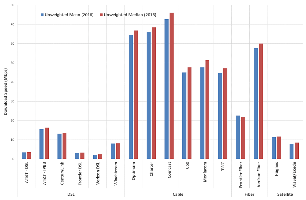
The difference between the unweighted mean value of latency and unweighted median value of latency is shown in Chart A.2. We show the satellite ISPs separately from those of terrestrial ISPs since their latencies are a magnitude higher. As can be seen in Chart A.2, there is very little difference between the mean and median values of latency for almost all the ISPs except CenturyLink and Frontier (DSL) and even these are within 10% of each other.
Chart A.2: Comparison of Unweighted Mean and Unweighted Median Latencies at peak hours (in ms) shown separately for terrestrial-based and satellite-based ISPs
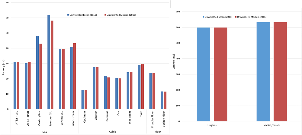
(B) Use of Weighted values (based on Subscriber Counts) instead of Unweighted values for broadband measurement metrics:
In calculating the composite speed for each ISP over all its tiers we have, in the past, used unweighted averages. The unweighted averages assumed that the proportion of panelists in each tier matched with the actual subscribership distribution for these tiers. The FCC and SamKnows attempted to create a panelist base that was similar in proportion to the actual subscribership to individual tiers as given in the FCC 477 data. This approach is not easily scalable due to the number of white boxes that would be required to continue to match the 477 data, and as the number of tiers and ISPs have increased over the years there has been growing discrepancy between the panelist numbers and the ISP subscribership numbers. This year a decision was made to shift to a much more scalable method of computing the composite ISP download and upload speeds, i.e. through the use of a weighted median where the weights are determined by either the ISP’s actual subscribership numbers or the subscribership numbers that they have filed with the FCC (Form 477). This year we calculated the ISP composite speed using both the older unweighted average method as well as the new weighted average method. Chart A.3 below shows a comparison between unweighted mean values and weighted median values for ISP download speeds.
Chart A.3: Comparison of Unweighted Mean and Weighted Median Download Speed at peak hours (in Mbps)

Chart A-3 shows that the use of weighted medians compared to the unweighted means did not result in significantly different results except for four companies. The most noteworthy of these was Optimum, which experienced a 31% reduction in speeds, from 65 Mbps to 45 Mbps; Comcast had an 25% reduction, from 72 Mbps to 54 Mbps; Mediacom had a 27% reduction, from 48 Mbps to 35 Mbps; and TWC had an 18% reduction from 45 to 33 Mbps. These results suggest that the number of panelists for the tiers within each of these ISP networks did not closely match the proportions of their actual subscribership. We emphasize that these results represent a change in the FCC’s methodology and may not reflect changes in performance.
Chart A.4 compares the unweighted Mean and Weighted Median values of latencies for both terrestrial-based ISPs as well as satellite-based ISPs. Once again the correlation between the unweighted mean and the weighted median values for latency is very high.
Chart A.4: Comparison of Unweighted Mean and Weighted Median Latencies at peak hours (in ms) for both terrestrial-based and satellite-based ISPs

All the charts shown till now compare the mean and median values for 2016. A comparison of the unweighted mean value of download speed in 2015 and the weighted median value in 2016 is shown in Chart A.5. Generally, ISPs saw improvement between the 2015 mean speeds and the 2016 weighted median values. The decline in speeds demonstrated in the results for some companies may be explained by changes in the number of subscribers for tiers that were measured with whiteboxes during the first few releases of the report.
Chart A.5: Comparison of 2015 Unweighted Mean and 2016 Weighted Median Download Speed at peak hours (in Mbps for all ISPs)
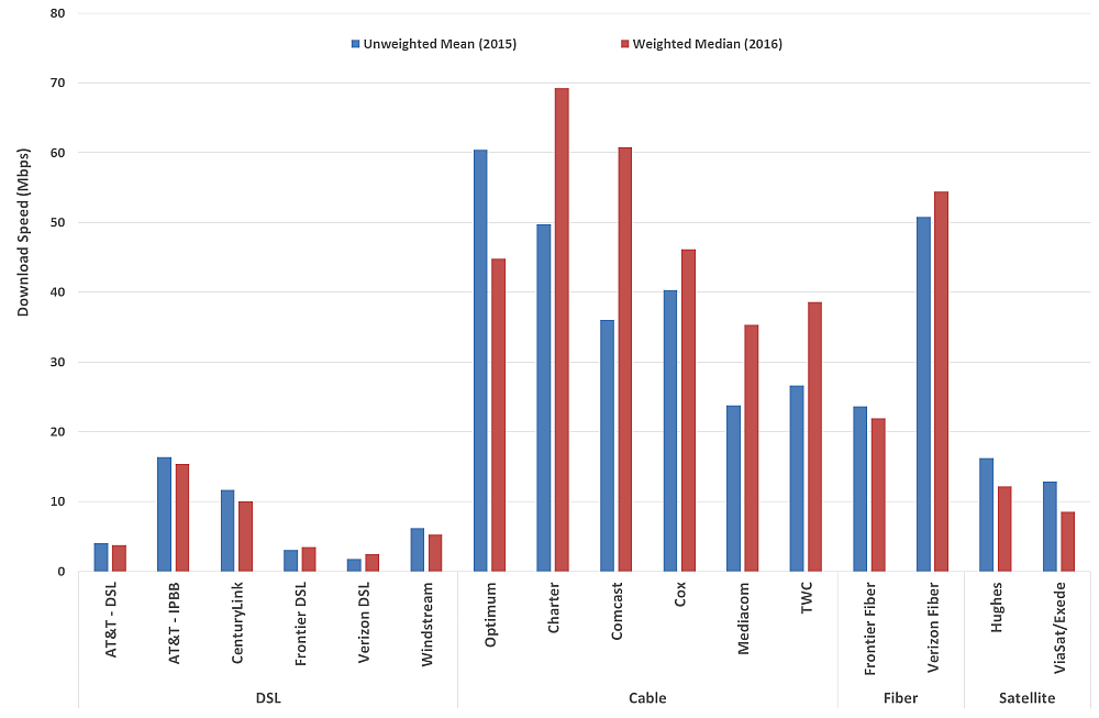
Chart A.6 shows a similar comparison for latency; with ISPs separated into terrestrial-based and satellite-based. The latencies are, except for Frontier (DSL) and Windstream, unchanged for the two years.
Chart A.6: Comparison of 2015 Unweighted Mean and 2016 Weighted Median Latency at peak hours (in ms) shown separately for terrestrial-based and satellite-based ISPs
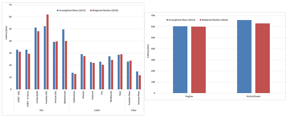
Going forward, the FCC plans to continue using weighted median values (with the weights based upon the subscribership numbers for each ISP tier as provided by the ISP to the FCC) since they are more accurate.
[1] The 2011 report was based on measurements taken in March 2011, the 2012 report on measurements taken in April 2012, and the 2013 through 2016 reports on measurements taken in September of the previous year.
[2] The median is that value separating the top half of values in a sample set with the lower half of values in a sample set; it can be thought of as the middle value in an ordered list of values.
[3] See “Open Internet” https://www.fcc.gov/general/open-internet (Last accessed August 24, 2016).
[4] DA 16-569 May 19, 2016 Guidance on Open Internet Transparency Rule Requirements - GN Docket No. 14-28, http://transition.fcc.gov/Daily_Releases/Daily_Business/2016/db0519/DA-16-569A1.pdf
[5] The ISPs that provided SamKnows with weights for each of their tiers were: AT&T, Optimum, Charter, Comcast, Cox, Mediacom, and Time-Warner Cable.
[6] See https://transition.fcc.gov/form477/477inst.pdf for an explanation of filing requirements and an explanation of required data. Last accessed 8/29/2016
[7] It is important to note some limitations on the results contained in this Report. Generally, only the most popular service tiers among an ISPs’ offerings were tested (i.e., those that constitute greater than 5% of the total subscriber base of the ISP), even though some service providers may offer other tiers not represented by volunteers contributing data to the program. We note that a particular ISP may offer faster service tiers either throughout their territory or in specific portions of their territory that are not as popular as the service tiers we tested.
[8] Hughes satellite Jupiter-2 is scheduled to be launched December 16, 2016.
[9] Video traffic comprised 70% of Internet traffic in 2015, and some expect it to grow to 82% by 2020. See Cisco Visual Networking Index: Forecast and Methodology, 2014-2020 White Paper, http://www.cisco.com/c/en/us/solutions/collateral/service-provider/ip-ngn-ip-next-generation-network/white_paper_c11-481360.html (last updated June 1, 2016).
[10] Starting in the previous report, we breakout AT&T’s IPBB (IP BroadBand) service from their older ATM based DSL services per its request. It should be noted that the IPBB service is more popularly known as U-Verse.
Due to the recent merger of Cablevision with Altice and the rebranding of the broadband service as Optimum, we have changed references to Cablevision to Optimum in this report and will continue in succeeding reports.
Starting two years ago, Verizon began advertising a speed range for each tier of their DSL broadband service rather than an “up-to” speed.
[11] These increases were calculated in previous years as weighted averages based on the number of participants. This year the weighted medians are based on the number of subscribers for each ISP tier.
[12] In 2014, the acquisition of Qwest by CenturyLink resulted in CenturyLink offering a 40Mbps DSL-based broadband service subscribed to by a substantial number of its subscribers.
The September 2012 decline in Verizon’s maximum advertised DSL speed included in our survey largely derives from customer transitions from DSL to Verizon FIOS (fiber) service as well as Verizon’s sale of service territories to other carriers.
Frontier acquired a number of service territories from other ISPs in 2011 and again in November 2014. Consequently, in this Report we omit metrics for Frontier (DSL) for prior years as they as are not comparable.
[13] The temporary drop in 2013 in Optimum’s maximum advertised download speed is due to the exclusion of the 50 Mbps tier (by Optimum’s request), which was replaced in 2014 by a 101 Mbps tier.
[14] However, subscribers of 50 Mbps or higher-speed download service tiers offered by cable broadband ISPs will only experience actual download speeds close to the advertised rates if they are using a DOCSIS 3 cable modem.
[15] Based on the current testing for the 2017 report, Frontier now offers 50 Mbps and 75 Mbps among its most popular tiers
[16] Where several technologies are plotted at the same point in the chart, this is identified as “Multiple Technologies.”
[17] Of the 5,583 panelists who participated in the September 2014 collection of data, 4,533 panelists continued to participate in the September 2015 collection of data.
[18] We do not attempt here to distinguish between these two cases.
[19] It should be noted that (1) the temporary drop in 2013 in Optimum’s actual download speed was the result of the exclusion of its 50 Mbps tier (at the request of Optimum) since it was transitioning this tier to the 101 Mbps tier; and (2) the change in median download speed from 2014-2015 reflects the use (for the first time in this Report) of statistical weighting, not a change in the actual speeds delivered by Optimum as a percentage of advertised speeds nor the unavailability to Optimum customers of higher speed tiers. See, e.g., Charts 4, 5, 6, 13.1, 13.2, 16.1, 16.2, 21.4, 21.5, 21.6 and Table 2..
[20] These increases were calculated in previous years as weighted averages based on the number of participants. This year the weighted medians are based on the number of subscribers for each ISP tier. We did not include AT&T (DSL) from 2011-2014 due to its reclassification in 2015 into a separate IPBB service that had been considered in the past MBA Reports as part of the AT&T (DSL) service. We also omit metrics for Frontier (DSL) from 2011-2014 since it acquired a number of services from other carriers during these years.
[21] We are comparing growth in actual consumer download speeds as opposed to the maximum service tier offered by an ISP in our survey.
[22] Some video streaming and some cloud-based applications fit into this category. E.g. Cisco Global Cloud Index: Forecast and Methodology 2013–2018 White Paper, http://www.cisco.com/c/en/us/solutions/collateral/service-provider/global-cloud-index-gci/Cloud_Index_White_Paper.html(last updated April 21, 2016).
[23] For Frontier’s Fiber tiers and, to a lesser degree, Frontier’s DSL tiers, we detected some anomalous traffic on our testing servers during the testing period. Our investigation has revealed that this may have been due to unanticipated delays to third-party upgrades to an interconnection point, and these delays may have adversely affected the results for Frontier’s Fiber service this year in a manner that is not fully representative of Frontier’s service.
[24] SamKnows, working with AT&T, was unable to obtain enough volunteers for AT&T’s 1.5 Mbps DSL service tier in time to permit this service tier to be included in the 2016 report. Therefore Chart 6, the aggregate service consistency chart, does not include data for the 1.5 Mbps service tier for AT&T. AT&T requested that we include their following statement regarding this situation: “AT&T was unable to validate the results in Chart 6 for AT&T DSL services. For example, the estimate shown for such services does not include the consistency of the 1.5Mbps speed tier. The exclusion of all data for 1.5 Mbps resulted from an insufficient number of volunteers recruited for this speed tier. The exclusion of this speed tier substantially underestimated the performance of AT&T’s DSL network..
[25] The 2014 and earlier Reports also included Insight Communications, which is now merged with Time Warner Cable, and Qwest Communications, which is now merged with CenturyLink. Hughes Network Systems joined the program in 2014. ViaSat operates under the brand name Exede Internet.
[26] The Form 477 results can be obtained from: http://www.fcc.gov/encyclopedia/form-477-filers-state-0.
[27] For this report we excluded some measurements using the M-Lab measurement servers, due to a problem with the architecture of those servers that affected the higher service tiers.
[28] The dates used for this report were chosen due to problems that were noted in one of the platforms during this time (which has since been fixed). The determination of the measurement period for the 2016 MBA Report was based on the FCC policy concerning the collection period for fixed-line MBA data (See: Data Collection Policy under https://www.fcc.gov/general/measuring-broadband-america-measuring-fixed-broadband )
[29] While the program’s methodology is not designed to produce an analysis at the state level in general, in the Appendix we provide statistics for those states for which we have statistically significant data.
[30] Independent research which the FCC MBA program helped to support suggests home networks as a significant source of end to end service congestions. See Srikanth Sundaresan, Nick Feamster, Renata Teixeira. Home Network or Access Link? Locating Last-Mile Downstream Throughput Bottlenecks. PAM 2016 - Passive and Active Measurement Conference, Mar 2016, Heraklion, Greece. Passive and Active Measurement Conference, pp.111- 123, 2016, <10.1007/978-3-319-30505-9_9>. <hal-01294924>
[31] Performance observed by a user may also depend on other factors, including the capabilities of their device and the performance of network devices within their home.
[32] The September 2015 data set was validated to remove anomalies that would have produced errors in the Report. This data validation process is described in the Technical Appendix.
[33] The software that was used for the testing will be made available for researchers and the general public for noncommercial purposes. To apply for noncommercial review of the code, interested parties may contact SamKnows directly at team@samknows.com, with the subject heading “Academic Code Review.”
[34] As noted, the apparent speed increases for AT&T and CenturyLink result from a reporting change for AT&T and a merger by CenturyLink
[35] In these charts we show Verizon’s median speed as a percentage of the average advertised speed.
[36] In Reports prior to the 2015 MBA Report, for each ratio of actual to advertised download speed on the horizontal axis, the cumulative distribution function curves showed the percentage of measurements (not panelists subscribing to each ISP) that experienced at least this ratio. The methodology used in both this and last year’s Report, by panelists subscribing to each ISP, more accurately illustrated performance from the point of view of the consumer.
[37] It is a property of DSL technology that actual speeds will vary widely within a geographic region. Thus the complementary cumulative distribution function will fall slowly, unless the broadband ISP’s advertised rate depends on the subscriber’s location.
[38] In this chart we have shown the median download speed of Verizon-DSL as a percentage of its average advertised speed for its tier.
[39] This chart represents an unweighted average of advertised and actual speeds across all panelists in each region. As such, it should not be used to compare the performance of broadband providers. Results for technologies in some regions are excluded when there were not enough panelists to ensure statistically valid metrics.
[40] This aligns with the guidance provided for the Open internet Order, DA 16-569 May 19, 2016 Guidance on Open Internet Transparency Rule Requirements - GN Docket No. 14‑28, http://transition.fcc.gov/Daily_Releases/Daily_Business/2016/db0519/DA-16-569A1.pdf
[41] For example, downloading a large file while browsing the web would limit the effectiveness of burst technology.
[42] The FCC does not have detailed information on which service tiers employ burst speed technology. This chart shows the percent difference between the actual speed and burst speed tests. Large differences in these speeds can be inferred as the result of burst speed technology being employed.
[43] Industry Analysis and Technology Division Wireline Competition Bureau, Internet Access Services: Status as of June 30, 2015, Report (rel. Aug. 2016), https://www.fcc.gov/reports-research/reports/internet-access-services-reports/internet-access-services-reports (Internet Access Report). Table 8 reproduces only the information for States and technologies included in Table 6 from Internet Access Report for connections by technology by state as of June 30, 2015 for connections over 200 Kbps in at least one direction, in thousands. Data for satellite connections was withheld in the Internet Access Report to maintain firm confidentiality.

